Wednesday
May162012
0088: Fixing the Avalanche
 Wednesday · May 16 · 2012 | 9:00 AM PDT
  13 Comments

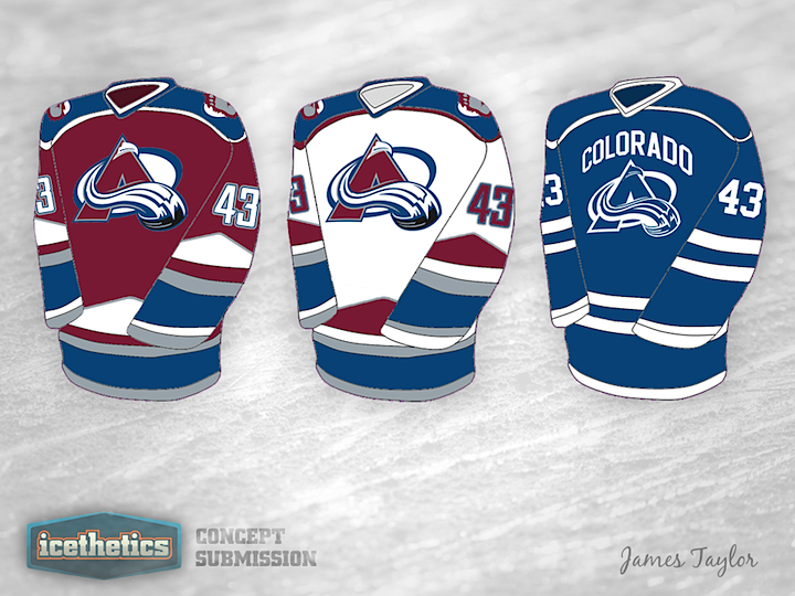
I keep seeing emails and comments asking when the Colorado Avalanche are going to finally fix their uniforms. I don't have an answer to that, but James Taylor has an idea about how they could do it. The wordmark notwithstanding, I actually like the monotone blue third jersey. Not a bad set here.
Designed by  James Taylor
 James Taylor


Reader Comments (13)
Interesting. Definitely better than what they are wearing now. I LOVE the return of the mountain peaks on the bottom of the jersey. The peaks on the sleeves are a very nice touch as well. The home and road are a great blend of classic and modern style while feeling familiar to Avs fans. The alternate though i am not so enthralled with.
A little color would go a long way especially in the logo. One thing I really don't like is the word ''Colorado'' over the logo. I have no problem with teams displaying their home city or state but when you put it with the logo, it seems like overkill.Plus it looks like the Canucks jersey.
3rd= Colorado Avalightning. Not enough black and an impractical design on the rest= 1 or 2 stars.
the third is wayy too similiar to the Lightnings. not a fan of that one, but love the other two, especially the pointed, mountain-like stripe on the bottom
I would take these in a heartbeat, besides the 3rd jersey.
home and away=lightning alt
alternate=lightning home and away
4/5
I like the set. I can't help but think that the alternate jersey is some kind of nod to the Nordiques (who had a very basic two tone jersey). If that is the case, it may help to make the alternate in the Nordiques color pallet. Overall, definitely an improvement on the current Avalanche uniform set.
As a diehard Avalanche fan... I don't like it.
There's just too much going on, especially having both the white and the grey on the home jersey. I appreciate the resemblance to the pre-Edge jerseys, but it doesn't look right to me. Ditch the white stripes on the home and the burgundy stripes on the away, and that might be better.
As for the third, its not bad but I think it would be better with a colored logo.
Nice try though. Went overboard with the striping though.
Like the second jersey but it needs a little more red. I don't like the third because it looks too much like the Canucks jersey the first is also better then the Avs have right now. Put it all together and I would say it's pretty good
I think with sublimation and the desire to go lighter that the design is very practical. The alternate is nice looking but does not fit with the av's I'd possibly use the foot logo on a basic red and gray jersey.
Overall I like them but there is too much striping on both the sleeves and the bottom of the jerseys.
Too much going on on the first 2, no no no. I love the third, but only because it's pretty much just the Lightning's jerseys with a different logo..
yikes
The home and away jerseys look good, especially the burgundy numbers with the blue outline on the away uni. Moutain stripes are a nice touch giving it that Colorado feel. As for the 3rd not digging it so much. Wordmark seems out of place with the logo and the numbers seem wierd too. A splash of burgundy or a bit of black would make it pop much more.