


Sunday
May202012
0092: Kansas City Scouts
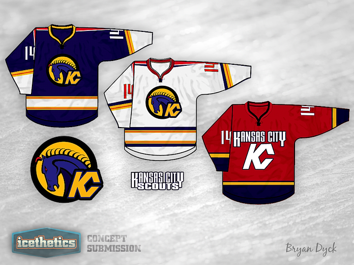
Here's an interesting one for our Retro Weekend. Bryan Dyck is bringing back the old Kansas City Scouts with a whole new look. Tomorrow we kick off another Minor League Week.
Update on Tuesday · May 22 · 2012 | 11:05 AM PDT by
 Chris
Chris
Chris
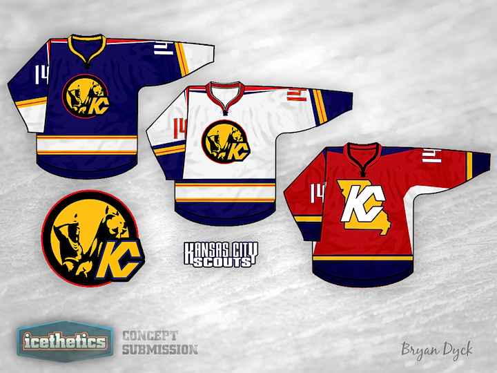
Bryan read your feedback and made some of the changes you asked for.
Designed by Bryan Dyck
Bryan Dyck 
Reader Comments (6)
You don't have the scout anywhere in the logo. The scout was the guy on the horse, not the horse itself. I like the colours and the third jersey but the home and away jerseys need the scout.
I really like the idea and the logo, but the colors just make me want to throw up. A dark violet horse is definitely not the way to go. Make it lighter and it'll be better.
Im Sorry but as a Kansas Citian who would wear pretty much any hockey jersey for a local team that hits the ice I dont think I could bring myself to wear this one. Here is what I like about them. The Blue one has a great design to it and the colors look good on it. The red looks good too and I like the KC logo being used as part of the jersey. Also I like the numbers designed. Here are the things I dont like The white jersey I think needs some more blue to it maybe in the stripes. The red jersey I think should have Scouts above the KC logo instead of saying Kansas City and also I think it needs some more color on the shoulder and maybe a different color collar.
Now on to the logo. It just doesnt work at all for me. Since the original logo was based on the scout statue that is pretty much the most recognizable statue in town I dont think you can get away with changing the logo too much if you are going to use the Scouts name again in Kansas City.
Kansas City having a jersey that says Kansas City along with "KC" that stands for Kansas City... A bit much don't you think?
My only criticism is that the cuffs and the area in between the hem stripes could be blue, but still a near perfect jersey set
I like how you put a modern look to the scouts but you still have the horse. I don't like how the alternate's red color is like the old Vancouver canuck's skate alternate logo. Your first two are really good though