Thursday
May032012
0075: Vintage Seattle
 Thursday · May 3 · 2012 | 9:00 AM PDT
  12 Comments

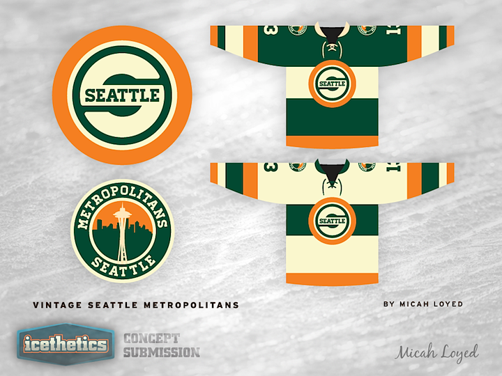
Vintage Week wraps up today as Micah Loyed gives us Seattleites something to think about. He's resurrected the Seattle Metropolitans. Here's how he describes the design: "The main crest has a nod to the Supersonics but incorporating 'Seattle' in a manor that is a tad more legible than the beloved 'Seattle on the path of the S' design."
But wait, there's more...

This one is just a bonus. Micah also put together another Emerald City-inspired concept for us. Thoughts on the Seattle Warbirds?


Reader Comments (12)
i'm all for the met's design. but while i like the look of the warbirds concept, having spent several years in the city i can say there's really nothing in the design (outside of the space needle) that says seattle to me. it's nice to see a designer try and get away from the cliched default northwest color scheme, i just don't see this working. someone should probably do a design in gray and safety orange for the color of the sky and the constant roadwork being done there.
LOVE the Metropolitans jersey. I can actually see an NHL wearing that. I would tweak it a little to replace the vintage
beigewhite with actual white.bombers would not be half bad too (with the history of boeing in seattle and the bombers they have made for the us military).
I don't think I could envision a better jersey for any team than this Metropolitans concept, totally perfect!
Metropolitans jerseys are insane! So sick! I'd love to see the orange (while still very cool) replace with a dark blue that would be more true to the Pacific NorthWest.
But again just fantastic.
Both of these are quite great. Fantastic logo designs and totally nails the vintage aspect. Great work on both. Creative choice of color schemes, too.
The Metropolitans logo has an uncanny resemblance to the Green Bay Packers, I must say. Yellow/orange outer circle - dark green - white capital letter. Still looks very good though.
I would buy both of those Met jerseys, Day 1. Fantastic.
I would happily buy either of those Mets jerseys, they look so good!
Overall the Warbird's design is tighter, but I am more drawn to the green, orange and white scheme from the Metropolitans design. The NHL is in need of some green. Curious to see what the Warbird design would look like with green as the primary color.
That Met sweater... That's one of the best kits I've ever seen. I hate saying this, but I kind of hope Seattle gets a team JUST in the hopes that they'll use that kit.
I'm not 100% on the vintage white being a league standard (maybe for special games), but the color scheme (blue/orange) and the logo is spot on!
**Whoever said the orange should be a dark blue, we already have a green/blue team in the area. Not saying it's bad, but the league is is desperate need of some color, and anything that goes against the black/white themes is aces in my book.
Impressive concepts. With regards to the city that will likely replace the Phoenix Coyotes, the Metropolitans concept will make me forget all the other cities who are in competition with Seattle for the next NHL franchise. I absolutely love the Green/Orange mix but would replace the vintage white for a true white. I think vintage white should stays where it belongs - in vintage jerseys. I have also some concerns about the logo. Don't get me wrong this logo is great and fits perfectly with these awesome jerseys. But for a new team to make his own identity, recycling an NBA logo is not the best way to do it. However, it could be an awesome shoulder patch with a glimpse to Seattle's sport history...
Before seeing this concept I understood why NHL lacks of green jerseys. It's not a color for NHL uniforms. Am I the only one who find green helmets with green jerseys, green gloves and green socks is just... weird? Just look at the Wild alternate makes me think It's christmas all over the place. But orange contrast in a manner that makes this green jersey the most beautiful I've seen since.. never.
The Metropolitans Jersey is almost there in my opinion. I actually like the beige, but maybe as a "third" jersey. I can't stress the importance that WHEN Seattle gets an NHL team we need to reign in the historical concepts and actual history Seattle has with professional hockey. That being said, neck laces are a must and throwback jersey's (whether or not they are the green red and white ones from 1917) are a neccesity from the get go. We have to remind people that we have already been here before. We have to tell the two Florida teams (who don't even see ice in that state) and the US teams that are part of the original 6, WE WERE THE FIRST US TEAM TO WIN THE STANLEY CUP! Keep up the good work and make sure the right people see this sweater.