


Sunday
Jul152012
0148: Duck... Duck... Mighty!
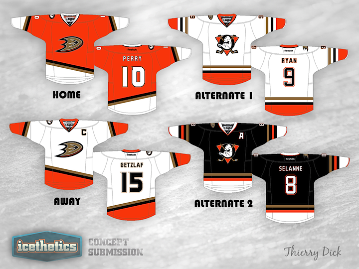
All right, so on Friday I was just messing around with Ducks fans. Today, not so much. Thierry Dick has created a handful of great Anaheim sweaters that seem like they're only a moment away from being worn in an actual NHL game. Great look! Way to own the orange!
Designed by  Thierry Dick
Thierry Dick 
Reader Comments (7)
Solid, though truth be told I do still think that the web foot D should just be relegated to their secondary logo on their shoulders and that the revitalized Mighty Ducks logo should make a comeback as their main.
Sure, cartoony, I know.... but you instantly recognized it regardless of whether or not you were a hockey fan, which is a lot more than can be said of a lot of the logos in the league. Just never made sense for them to throw away an obviously marketable brand like that, even with their split from Disney.
Not a fan of the amount of white on the Home or Alternate 2, or having only the one shoulder patch on each jersey. Also, the stripes on the home and away need to be angled upwards in the same direction as the D-foot, right now it's not "flowing" properly and it feels like there's an awkward empty space on one side of the jersey.
Other than that, I quite like this!
The two alternates are very nice, I much prefer the striping and obviously the logos used on those two. The home and away not as much, but you've done very well considering there's not much good you can do with the Ducks' current logos and colors. Maybe swap the white and black around on the home.
i agree with chicagolander bring the original logo back to a primary
i think the home and away jerseys here should be done away with and the the two alternates should be switched to home and away status instead. Also make sure that there are two shoulder patches and not just the one.
I wouldn't mind replacing all the gold with that original duck green. could look sharp. clearly no other team has this color scheme in the NHL though.
Make the alternates into the home and away, ditch the away, and make the orange one an alternate