Tuesday
Jul032012
0136: Orange Oil
 Tuesday · Jul 3 · 2012 | 9:00 AM PDT
  14 Comments

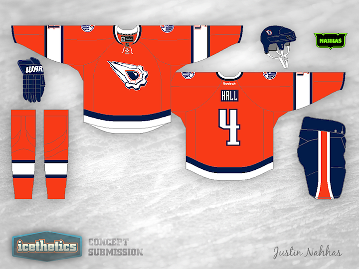
Anyone else think an orange Oilers jersey is long overdue? Justin Nahhas mixes that notion with the Oilers' first-ever third jersey design from the '90s. I miss that one, by the way.
Update on Tuesday · Jul 3 · 2012 | 6:51 PM PDT by
 Chris
Chris
 Chris
Chris

After reading through some of the comments, Justin made some revisions.
Designed by  Justin Nahhas
 Justin Nahhas


Reader Comments (14)
I would suggest more traditional striping at the bottom of the jersey (perhaps to mirror the striping on the sleeves and the socks). Also, there is something about the name plate that does not seem quite right. Otherwise, a very sharp looking jersey, well worthy of being an alternate to be sported by the Oilers.
this is sick, but all I can think of is the Flyers.
I'd rather see the orange Alberta Oilers jersey from the WHA days
Yes, the Oilers have orange in it's colour scheme, but it doesn't mean we have to have a orange shirt. The original 3rd jersey for me is still one of the best 3rd's we have seen. It's often voted high up in the various votes in here. I'd love to see them return to that jersey as an 3rd jersey, as that would make a dandy 3 jersey combination with the current shirts.
This doesn't work in orange, you don't mess with such a good design. By all means use the logo, but not near enough just alter the colour. It doesn't work for me. It's been a while since I've seen a decent Oilers concept. I think it's because I like the current set we've got so much that it has to really jump out to make me to wow. It is unfortunate, as I do enjoy seeing attempts at Oiler concepts...
I think a baby blue would look a lot sharper than the dark
I always loved this Oilers third jersey logo, and I believee they should bring it back as a third, while tweaking the colour scheme to match their current colours. Hence, I like the idea behind this concept, but the actual look doesn't look right to me. I think there's too much white and not enough blue. The logo doesn't really work in white, I would have kept it grey/silver with blue and orange accents.
At first I was taken back by the orange. Then, I didn't like the small name and the blue stripes on the sleeves thinner than the torso stripe.
But after a few seconds, I liked it. Not much orange in the league besides the Flyers. Reminds me of the WHA Raiders/Mariners.
Justin Nahhas jersey is incredible! Love it!
I honestly have no idea how/where to rate this one. At some glances, I love it. At some glances, I think the logo needs more color. At some glances, I think the jersey needs LESS color. And at some glances I hate it. I'm truly torn.
I really like it, but the orange looks too much like the Flyers. Also the logo is a little weird, but it's better than the current logo for sure
fun stuff, but none of these fit in with the oilers branding. gotta stick to blue and the current logo with orange as secondary. kill the mcfarlane already. it was fun while it lasted.
WHA is a fun jersey too but way too orange. the white version of the WHA makes more sense but would be hard to arrange wearing white at home.
Honestly, I think the Flyers are the only team that has ever looked good in orange.
Lose the contrasting name plate and this is a winner. Orange is different!
Hey I sent one a lot like that blue one in a few months ago...