


0135: Ducks Re-Bourne
I'm launching a new concept series today from artist Andrew Bourne. He asked if I'd feature his rebranding series, tackling the entire NHL. I told him I'm game so you'll start seeing his work here every few days, starting with the Anaheim Ducks.
Now, what Andrew's doing doesn't exactly fall under the category of "rebranding" in my book. He's changing colors and redesigning jerseys and so forth. Instead, I'm calling his series "Re-Bourne." Hope you get a kick out of it, as I have. Below and in subsequent posts you'll find Andrew's explanation of his work.
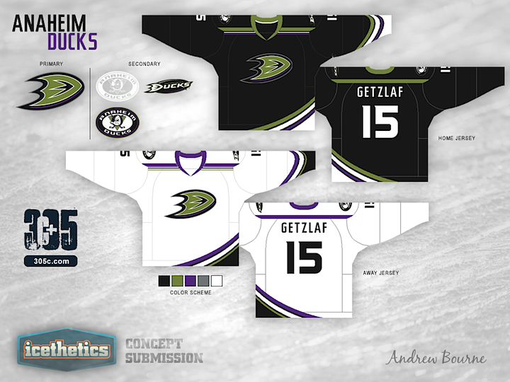
Although the orange streak in the current jersey format connects Anaheim geographically (Orange County), I'm not a fan. The orange is a bit too distracting in the Black, Gold and White color palette. It seems to really jump out and take all of your eye's attention. So, I decided to mute the colors a bit and return to a near replication of the Jade & Eggplant. The green is a bit darker than the original, less teal and more 'pond scum' green. The eggplant was tweaked to a more full purple which worked well with the black.
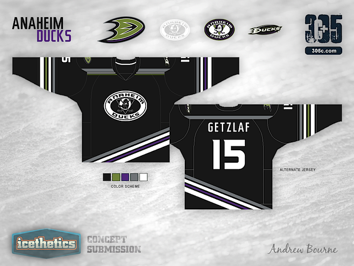
You don't see a lot of asymmetrical jerseys in the NHL, or AHL... or KHL for that matter. Why? Because they usually don't work. I can't say that my idea will work, but I believe that it could work. In the current jersey, Anaheim has a few curved stripes from left to right across the bottom. I liked that idea but I didn't like how it just stops on the left edge of the jersey, leaving a strange black area. The sleeves in the third jersey have a simple striping similar to the bottom, except one side has purple while the other has green. It gives the alternate sweater a sense of asymmetry without actual asymmetry. Make sense? Probably not...
 Andrew Bourne
Reader Comments (11)
The first jersey reminds me of Donatello from TMNT, soley on the colors only. I'm not too sure why, but it's going in the right direction.
The third jersey with straight lines has a neat look to it, but the Ducks' idea of having a weird curving, off-centered striping system never seemed like it was a "purposeful" decision. I think they might've started with straight lines, like the one you have here, and someone who was making the actual Ducks' design, slipped on the computer mouse, and then, he or she realized they could probably work with that mistake and so and so..
Overall, I do like your creativity.
It's a good start, actually, but try to make the right side more dramatic and larger (basically shift everything left some more)....and fix the inconsistent and unappealing shoulder thing, make it circular/ovular to match the rest of the design
I think this jersey would do much better if it had different colours, because purple, puke-green yellow, grey and black kind of make it look a little boring
Yeah, I definitely see Donatello from TMNT now that I step back and look at this jersey. Not a horrible thing but obviously not my intent. I'm agreeing with what most of you have said so far.
I knew I took a chance on Anaheim's asymmetry and 'pond scum' green but, you need to take a chance every once in a while. I do also think that the home/away sweaters could use larger striping. Maybe I'll take all comments into consideration at the end of this and see what I can come up with for a second round. Who knows?
There are too many colors. I think they look more like practice jerseys
I think the "D" has to be in orange. Unless there are ducks with green feet that I don't know of..
I think there are too many colours and odd stripes. Not one for cookie cutter either which this is not. I wish I could execute the design programs you guys use.
@ Andrew Bourne
They look like practice jerseys?
When's the last time you saw an NHL practice jersey with more than 1 colour + White or Silver?
One flaw on the way the concepts are arranged is that we can't see the backside of the arm that has the striping on the top two, so we can't see how that curved stripe comes back around on the backside of the arm.
Elements of the design are promising, but the colors really don't work at all for me. If not for the reassurance of the colors of the Icethetics website, I'd think my monitor was on the fritz.
So the old Kings colors have gold added? On a Ducks jersey!? Ugh. Bad idea.
Well I think I'm the only one who really likes this jersey. Colors and everything.