


Thursday
Jul052012
0138: All-Star Sashes
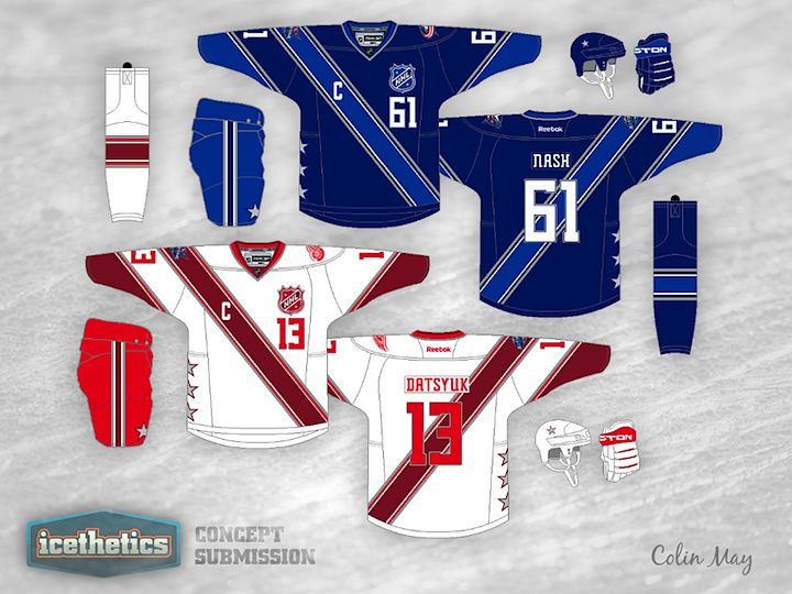
Just over a month ago, I posted a concept Colin May created for the Columbus Blue Jackets. A few readers thought the idea might make for some nice All-Star jerseys. So Colin took a stab at that and this is what he came up with.
Designed by  Colin May
Colin May 
Reader Comments (9)
the red sash on the away jersey makes it a little difficult to read the numbers, but besides that these are excellent.
I like it except for the number on the front. I really wish NHL teams would stop doing that.
It's hard to see the numbers on the back of the red and white jersey. The pants on the white jersey should be the same colour font as the sash just like the blue jersey.
Not a fan.
I certainly like this design better than the real one. A clean crisp design, that is different enough from normal designs to make it interesting.
I do think though that red and blue are boring colors. Sure, they are safe, good looking colors that work for a real team. The All Star Game though is a chance to go a little crazy with the colors. How about Neon Green vs. Corral or something like that?
Meh. I immediately thought "Girl Scouts" when I saw them.
Looks like a soccer jersey. Not a fan at all.
Use the bright red for the wrists and sash on the red uniform and the darker red for the numbers. Then it'll match the collar/pants. Yes I know that the dark red then almost disappears on the white jersey (it'll still be in thin stripes on the wrists/sash though).
Do away with the chest numbers.
The concept is good, and for an all star game it's great. Perhaps us Black numbers on the white shirt to make it stand out a bit more.
I hate being picky, as I like it, but something isn't quite right. I look at it and think what is it, and I've get two answers, the sash is the wrong way, I look at the way the NHL shield is and the sash should follow that . Then I think, well no it's OK it's too minor. So I look at the sleeves and the striping on them make the jersey seem rather too busy. More so with one going with the sash and the other not. Then I think can we have plain sleeves?
I do like the design, but I can't put a finger on why this design is quite perfect.
Nice try though and I'd be happy with someone sitting down with this idea and running with it.