


Thursday
May312012
0103: A Novel Concept
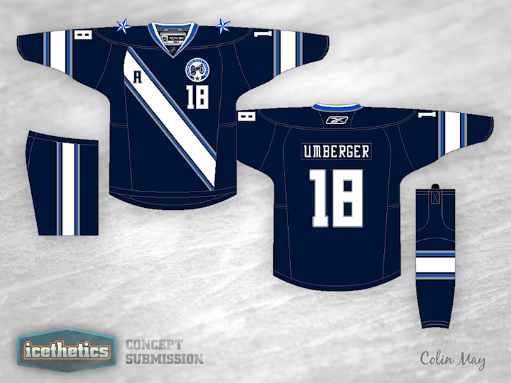
Today we're looking to Colin May's rather untraditional look for the Columbus Blue Jackets. I kind of like the sash-style striping, but I wouldn't cut it off there, I'd go all the way over the top and around the back.
Update on Thursday · May 31 · 2012 | 5:43 PM PDT by
 Chris
Chris
Chris
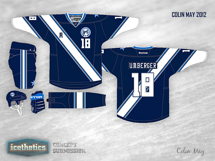
Colin took a stab at some revisions. He also tells me he's working on an All-Star version as suggested in the comments.
Update on Thursday · Jul 5 · 2012 | 11:36 AM PDT by
Chris
Chris
And here's that All-Star version I mentioned.
Designed by Colin May
Colin May 
Reader Comments (9)
I love the slightly soccer inspired jersey ideas. It is so different than anything that has ever been in the NHL, in its entirety.
I believe the smaller markets, like Columbus, could benefit from unorthodox designs. Anyways, this is very clean and simple. The best logo Columbus has is the canon logo, so it fits. I agree that the actual slash looks like it got cut off way too soon. Have it wrap around the body and see what that looks like. Also, play with the arm stripes. What would it look like if they were more diagonal?
Overall, good idea, just try to push it more!
I think this would be an EXCELLENT All-Star uniform for this year's game in Columbus if you just put every player's own team crest on their chest. The name and number fonts give it the unmistakable Columbus feel, but the progressive design screams "All-Star."
Whip up a matching (vintage?) white version with red trim and we've got ourselves a beautiful All-Star Game in Ohio.
I agree with what Sloth said. This could be a great All-Star game jersey. If I didn't love Columbus' alternate jersey so much, I'd be happy to see this replace it. That being said, awesome job Colin!
I like the original better.
in the all star version i would put stars inside the stripes
I don't know if I'd want to see this design as a team sweater, but I agree, this could be the basis for an EXCELLENT All-Star Gamer!!
the revision looks sweet! I love their uniforms but I would buy another jersey if they were this different
The new one looks great! I thought the original had too many stripes going in different directions, so I really love the new sleeve design.
The revision would be awesome if the Blue Jackets used it. It would be one of the best NHL jerseys, in my opinion!