Monday
Aug272012
0191: Blackhawks Re-Bourne
 Monday · Aug 27 · 2012 | 9:00 AM PDT
  11 Comments

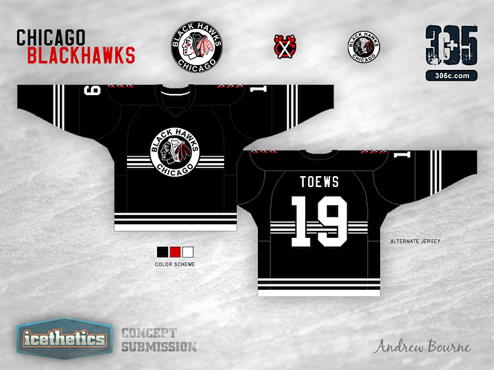
It's been a while since we last saw an entry into the Re-Bourne series by Andrew Bourne. We pick it up with a very stripped-down set of jerseys for the Chicago Blackhawks. Thoughts?

Ask any hockey fan to name the top five best jerseys in the league. I bet Chicago will be on every list. Chicago has a classic style and is the class of the league. It is very hard to even try to improve their style, but I took a whack at it with a giant stick called, 'history'.
Designed by  Andrew Bourne
 Andrew Bourne


Reader Comments (11)
most of the stripes on these re-boune jerseys are too wimpy. bigger, bolder stripes would make these sweaters (and the rest of the sweaters in this series) better. This is the first entry in this series that hasn't puzzled me with the colour choice, hard to go wrong with black white, red for the hawks. Although the omission of a red jersey is glaring. I don't understand the use of the 3 secondary marks on the shoulders, to me this just looks weird, and it would look better if there was one that was properly sized.
Nice effort, but you need to judge a concept not only by what it looks like but what it's designed to replace.
In other words, 1/5. Sorry, a concept would have to be earth-shatteringly good to be put next to what the Hawks currently wear. By itself, the concept's okayish, but it's nothing compared to what Chicago currently wears.
Wow. I agree with every single thing Colin M. just said. Beat me to it.
Honestly, there is not a single element of this set that I like. A big miss in my opinion. Sorry.
Not good. Doesn't seem to have rhyme or reason to any of the changes. Upon browsing Andrew's website, I would say that he needs to hone his Illustrator/Photoshop skills before pursuing a graphic design career. Still too amateur to be charging people for his work.
However, with that said, it's always a perilous notion to present your creativity for the public to critique. As a designer myself, I admire his openness to share his creations.
I do not like the actual Blackhawks jersey, or logo or really anything to do with them, but these jerseys are even worse! Not the best concept.
Looks like a newspaper.
i agree with colin and also think centering and completing the chest stripes would improve the look as well
It has great potential...
Believe me, I know how good the current jerseys are for Chicago. So, most any modification is hard to swallow.
With that said, I tried to take Chicago back to it's roots and work with the original design of the 'Black Hawks'. I wanted the jerseys to be mostly black and white with only a small hint of red and really give the jerseys a military feel.
The shoulder area has 3 small tomahawks and unconventional striping to try and pull off this military feel of shoulder striping and collared shirts.
I really tried to strip down this jersey set because the entire history of Chicago design is all over the place. I believe these jerseys pay tribute to the initial idea of the franchise while hinting at some of the modern designs.
If you don't like it, that is perfectly fine with me. The harshest critiques are usually the best to get me thinking of how to improve my designs for the masses. Thanks!
I think I like the striping pattern... just not for the Hawks. I think it might look good for a Carolina alternate. The white is actually really sharp... again just not with the Hawks logo.
@Mayhem, that was a really unnecessary and rude comment. It's one thing to tell a person to improve skills (which all arts do everyday to get better) then to tell them to not have a career in graphic design. Just because it's not your cup of tea doesn't mean others don't like his work, a lot of people do, otherwise he wouldn't make a living. I'm glad you "admire his openness to share his creations," but what's the point if people like yourself are telling someone to not have a career in graphic design. Learn to give constructive criticism, not a-hole comments.