


Sunday
Aug262012
0190: San Francisco Sunday, Part 4
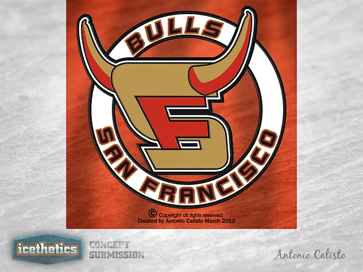
We're continuing the San Francisco Sundays series of potential secondary logos for the ECHL's new franchise, the Bulls. We start with Antonio Calisto's attempt. It's pretty sharp but it does lack any representation of the Golden Gate Bridge.
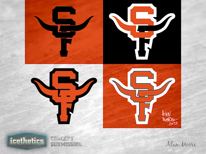
Alan Moore produced a series of Giants-style logos with horns protruding out of them.
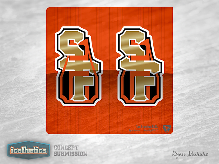
And Ryan Muraro didn't just intertwine the S and F together but also with the Golden Gate Bridge. Not a bad look, but maybe a little less with the gradients. But it does go well with the team's existing primary logo.
Designed by  Alan Moore& Antonio Calisto& Ryan Muraro
Alan Moore& Antonio Calisto& Ryan Muraro 
Reader Comments (6)
I love Alan's entries! Very creative and well done. 5 Stars!
Enough SF Bulls logos.
Alan gets 5 stars easily.
Very clean, creative and really quite attractive design, the more I look the more I appreciate the way it flows together... total shame they didn't choose his work
Agreed! Alan's entries are really well done. I especially like how the positioning of the letters give the appearance of the bull's head.
The second one, Alan Moore's design, is truly amazing. It looks very legit and professional, and it ties perfectly with the whole Bulls identity. If I owned a sports team in the SF area, I would buy that logo in a heartbeat. I can picture it on a cap and as a shoulder logo on a hockey jersey.
Really this is kind of like trying to make delicious soup out of crap. The name is boring and has nothing to do with the area and the colors stolen from the Giants. No how hard designers here work on the logo they look like nothing more than a mutated Giants logo. This is not taking away from their skills. It's just that I don't know what the hell this team was thinking of when they picked this stupid name, colors and logo. A really bad start to a market that is already hard to succeed in market.