0194: Avalanche Re-Bourne
 Thursday · Aug 30 · 2012 | 11:19 AM PDT
  17 Comments

Andrew Bourne continues his NHL makeover series today with a look at the Avalanche.

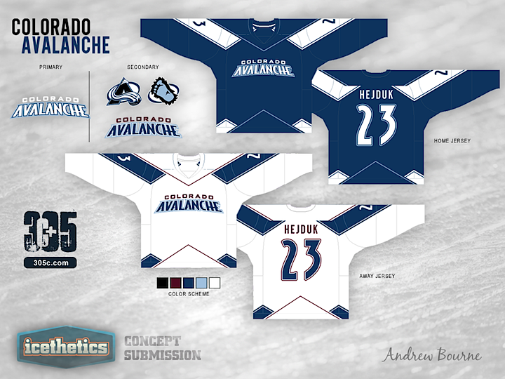
For the most part, Colorado's color scheme is right on the money. Their black, blue, burgundy, white and silver really remind me of Colorado. Cold and mountainous is the way to go. Having said that, I wanted to tweak those colors to give you more of a feel for the mountains and the snow.
Even though The Avalanche have the two best logos in the entire league, I decided to use them in the secondary role. The very modern look of the home and away jersey designs just didn't work with the rotated and angular A logo or the circular Sasquatch logo.
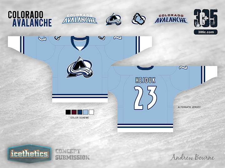
I also wanted to pay tribute to the Nordiques somehow in the third jersey. So, I took their simplistic style and added two stripes to symbolize, you guessed it, their two championships. The jersey is reminiscent of the Nordiques but still has a style that Colorado can call its own.
 Andrew Bourne


Reader Comments (17)
I would like to see the alternate jersey as the primary and create a away jersey from that. The baby blue is boss!
the striping NEEDS to be bolder. I like the striping pattern on the home and road (it reminds me of my hometown Vancouver Whitecaps FC logo), but would like to see something done on the sleeves or cuffs (they are too plain as is, and the sweaters do feel empty because of this). I have no clue why you chose to use the wordmark when you have one of the best logos in pro sports to work with here. poor choice. colour scheme is good overall, but the inclusion of burgundy on the road sweater seems like you only did it because you felt obligated to include it, it should either play a more prominent role, or be left off entirely, other wise it just looks like an afterthought.
23 more to go...
Nice Job! I think The Avs have one of the worst desgins and color schemes in the league. The burgundy in their current jersey is really bad.
The only thing for me is the home jersey feels really heavy and dark. Maybe because of the type logo. Maybe the light blue trim could be wider. But then maybe shots and shocks would balance it out.
Oh boy, I can imagine the comments already...
I am a huge Avs fan and I agree with them having the two best logos in the league.....SO WHY AREN'T THEY FRONT AND CENTRE?!
I just want their old jerseys back, not the Reebok Edge ones. Don't change anything. They are too good.
While I like most of this series ideas, I always seem to have a problem with the colors. Every time they look odd or washed out or monochromatic... Like I've been looking at a CMYK printing without one or two of the colors... So basically I usually like your concept a lot, but definitely not the colors used. But that's just my opinion. Good work nonetheless!
How much has he paid to continually be put on here? Each disappoints more than the last
I have never, EVER heard anyone call the Avalanche's logo the best in the league
He did a great job on this concept and I like the mountain design on the bottom, however in my mind the top of the jersey just doesn't work for me. Also the lack of the burgandy in the set just doesn't seem right. That third jersey is quite unique, but to me it just doesn't say Avalanche to me.
Good job to Andrew on his many concepts and hopefully they keep rolling in.
That powder blue makes me cringe
It kind of reminds me of the Air Force Academy (Colorado Springs)'s uniforms. Interesting, but I'm not sure if it's an improvement over what they have now.
The post about the CMYK colour guides articulated better than I could the thoughts I had. A lot of these concepts have a lot of colors, but not many that aren't variations of one color. A lot of monochrome, minimalist striping, a lot of graphic design and not sports design.
I just think these pencil thin stripes and sixteen blues don't do the Avalanche justice.
Plus, for a featured concept series, I'm incredibly disappointed, as i don't feel anything has usurped the originals, which should be the objective of a series like this.
These just don't look good to me, the alternates are bland and that powder blue with the washed out logo just looks flat. The home and away look unfinished and I have to agree with Ryan, don't talk about how great the logo is and then banish it to secondary status. On top of all that, the league has enough blue jerseys, we don't need anymore.
One quick note, reading my short description below the jerseys can help a great deal in answering your questions you have about the jersey set. (Why I chose a word-mark instead of the A-logo)
Other than that, I think Colin M. nailed it. Great critique! All of these jerseys were made months ago, so, although I can now see that the striping is thin, I can't do much about fixing widths. I admit that I worked backwards on this and let the jersey design dictate which logo to use... If anyone read the full length description, you will notice that this jersey set is one that I want to re-do the most.
Neonix - Agreed about the colors... It's something I've been disappointed in so far. Some look washed out, some look neon, I'm not sure what's going on there. It is frustrating.
Nahhas - Agreed as well. I'm not sure what was going on with me on this jersey. I'm glad some people really like it but to me, these 3 jerseys, although unique, are just all over the place. Not cohesive at all.
To everyone else, Thanks for the words of encouragement and critiques! I'm glad that some people like my designs and that the internet isn't just full of hate.
Oh, and Ling - I paid a boatload to get on here. You know, all that big time cash coming in from my 'failing graphic design career' ;)
The Avs don't look right without the burgundy, and that baby blue is horrible.
Quick, Chris! Better post today's concept or else the streak will be broken!!! It's already past 11:30 PM in Newfoundland!
These are AWESOME. For a roller hockey team's practice jerseys. For the NHL? Not even close. Ignoring the bland colors and marching band striping, the double wordmark design on the front is just bad design. If you have to completely spell out who the team is then don't bother. The city or team name alone is bearable. Both? No way.