0172: Inspired by the Shield
 Wednesday · Aug 8 · 2012 | 9:00 AM PDT
  10 Comments

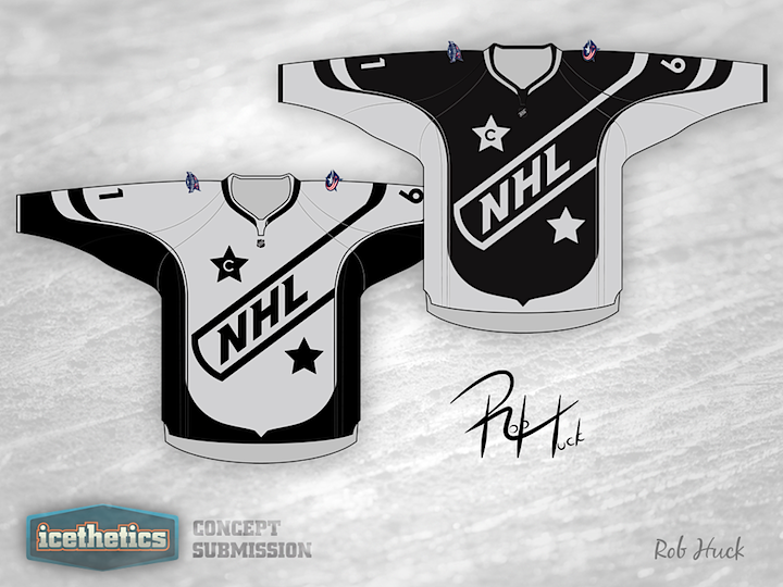
My job's easy today. Here's Rob Huck to tell you about his NHL All-Star uniforms:
As you can see, these All Star jerseys take their cue from the NHL logo. I used to admire the All Star jerseys back in the 1980s when the colours reflected that of the old league logo, and I would love to see that reflected again.
I was also inspired by two of the recent concepts posted on Icethetics. The first is the "sash" concept used in Colin May's recent submissions. I tweaked it a bit to turn the sash into a one-sided shoulder yoke, which happily enough also creates the illusion of a hockey stick on the shoulder. (A high-sticking minor of course, but a hockey stick nonetheless.)
Second, I challenged myself to eliminate the use of white in my concept in the manner of Brian Brideau's Boston Bees jerseys. Yes, we all know how much you love the colour black, and the silver in my jerseys seems a little bland, but I think I met this challenge. In addition, the concept could potentially incorporate any two colours quite easily if one were so inclined.
 Rob Huck


Reader Comments (10)
These concepts are good.. but at the same time I feel they are very safe. When Rob says ' I think I met this challenge. ' I would agree with him, so Im am just going to nit pick at the little things
COLOUR: to really get the effect of these jerseys in use they need to be presented in colour. If they are intended to be used for the all-star game throw some blue and red on, even some old school orange. I would suggest:
home: coloured chest - black under arm
road: 'white' chest - coloured under arm
The pinstripe that helps to transition the black to the white I think should continue to the bottom of the NHL crest insted of stopping where the crest curves toward the center of the jersey.
The shape of the stars feel kind of 'bubbly' to me. maybe the lines could be a little straighter...
I feel like the transition from crest to stick is a little sharp, I think those edges should be a little smoother to match the style of the sleeves.
And what about the back of the jersey, do you intend to have the crest on the back as well or something a little simpler
awesome, only gave it 4 stars tho because it could be confusing on the ice...make one blue and the other have red trim (or vice versa) and its perfect
Great job, one of the best concepts I've seen in a while. He did a great job of reflecting the NHL logo theme. Some color would be nice though, can't see two teams going at it in Black/White. Other than that it's an amazing jersey. Retro is all the rage in the NHL right now and I can see how these would be a good seller. JUST AWESOME!
Ugh, come on, enough of the contemporary Reebok Edge-esque jersey designs already. They have been a disaster so please stick to a traditional-looking hockey sweater once and for all.
I actually like the idea of this. I too, loved the old orange and black logo unis of the 80's. The thing I like these days, however (up until the past two years), was taking the host teams colors. Wouldn't mind seeing this look in CBJ colors.
I actually LOVE these.
Greatest All-Star game idea I have ever seen. You sir deserve an award! I wish I could give this 10 stars!
Great idea. These are super cool.
I think the concept is good... may be more interesting if the "away" jersey used the coloring of the home team (in this case blue and red). 1) it reduces the confusion of having it look like LA is playing itself. 2) if they want to reuse the concept at least one jersey may change from year to year (marketing)
Thanks for the feedback, everyone.
This was my first attempt to design a jersey. I had been a fan of this site for a few years, but only recently I took an Illustrator course and decided to give it a shot on my own. I wanted to create something a bit unique yet not too crazy, and I think I was able to do just that.
I do agree with the comments on colour as I definitely understand the limitations this would have if used in a real-game situation. Other colours would certainly be warranted to differentiate the two teams.
Regarding SAAAV's suggestion to continue the piping below the crest, I agree fully. In fact, I tried doing just that but couldn't figure it out well enough to make it consistent, so I dropped it. Had I had more skill, that would definitely have been done. The same goes for the smoother transition between the "stick" and "blade".
And I agree that I ought to have developed a back-side view too. I was half-way complete my initial draft when I realized my template didn't feature a back-side. Ugh. So I decided to just let it be and try to find a different template next time around.
However, I will defend the slightly rounded stars. I wanted them with a bit of an arc to reflect the curves in the rest of the design. You don't see that style too often, particularly in the jersey-design world.
Again, I really appreciate the feedback and I would love to see someone else try to take a stab at this concept -- particularly the large-crest design -- and improve upon it.