Wednesday
Jan162013
0333: How Minnesota Was Meant to Look
 Wednesday · Jan 16 · 2013 | 9:00 AM PST
  14 Comments

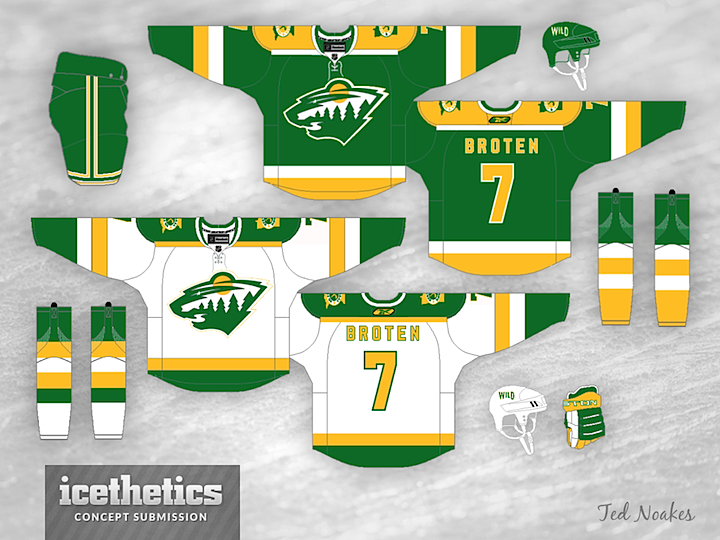
If Minnesota can't have the North Stars back, perhaps they can at least have their jerseys back. Ted Noakes has revamped the Wild to look like their state's NHL predecessor. I'd call it a win.
Designed by  Ted Noakes
 Ted Noakes


Reader Comments (14)
Two word: Ug - Ly
the North Stars had a great hockey nickname and a great jersey. I would have loved to have seen the Minnesota franchise be the North Stars ala Jets, instead of the Wild
Gave it a 2 because of the socks.... that's the most... err.. unique set of socks I've seen on here in a while
I like it. classic look. only couple of suggestions. the straight light at the bottom of the shoulder yoke is really not necessary and i would go with green back number and name the same way the sleeve numbers are done, just for contrast on the ice.
The logo looks a bit too big on both of the jerseys - it also looks like its lacking the depth that it currently has - it needs one more color. I would also switch the lettering to the thinner/taller font that they currently use, maybe the numbers also. Otherwise, I wouldn't complain if the Wild were to take this on as a "fauxback".
it would make a great third jersey. i'd be interested to see it with just the tiniest bit of red added to the look, but that's just me.
Sweet!
Agreed. Yellow numbers (and names) on a white jersey are too hard to see, especially on TV. I don't like the stripe around the bottom of the pants legs either. Otherwise, nice.
Maybe an outdoor game, so they can pay tribute to the Minnesota past time. These colors aren't as good as the ones they currently sport.
you may be on to something here. it seems a little bright, but you are close. there is too much black used in sports today, but i think a little black on the logo and in a couple other key areas would help. the north stars were able to pull off these colors because their logo didn't have a lot of white space. as nice as that logo would look by itself, i think it is just too bright an image to have on either the green or white jersey and would actually make it harder to see on tv or in the stands.
i think it's great except the logo colors. i think too much white especially on the green. i can think of 2 reasons: the contrast is too intense and then add the jagged tree stripes, it's jarring. and the other reason i can think of is that the sky is brighter than the moon/sun and that's weird.
i just did this real quick and it looked great, make the moon/sun white and the sky yellow. leave the outline and river white.
oh and the outer yellow stripe on the white jersey is barely visible. try the green, or like someone said, a tiny bit of red? probly green.
It's a good idea, but with the current Wild logo the yellow moon makes it look like someone is making an omelet.
now i can't unsee the egg
Could someone blow up that Green/Yellow Wild logo?? I'd like it as a Twitter header and a wallpaper for my laptop and I don't know how to do any of that fancy design stuff haha! Thanks!!!
As for this concept (I'm born and raised in Minneapolis), I LOVE it! I agree with some above comments though - I'd make the road sweater jersey number/name green with a yellow outline. Other than that...wow, what a beauty.