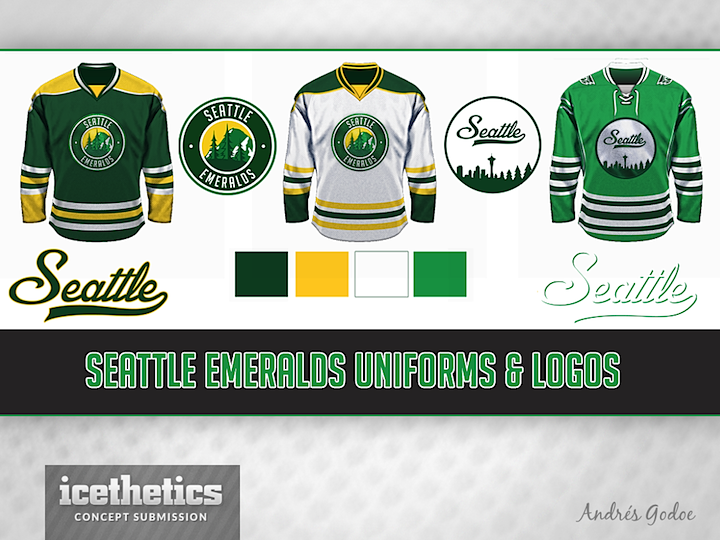
0597: Seattle Emeralds II
 Sunday · Oct 6 · 2013 | 9:00 AM PDT
  10 Comments

This Seattle Emeralds concept is in no way related to the one from last Sunday, so it's just a coincidence that Norway's Andrés Godoe has used the same name. Andrés says he came up with this design for a simulation hockey league.

After a couple months worth of Seattle Sundays, I'm retiring this theme for a little while. That doesn't mean you won't still find Seattle NHL concepts on these pages. It just won't be on Sunday.
Starting next weekend, the New York Islanders will be our Sunday feature. You can't believe the number of Islanders concepts I've been getting since the move to Brooklyn was announced and the new third jersey confirmed. They're all interesting in their own way and I want to take the time to feature them properly. Hope you enjoy them as much as I do.
 Andrés Godoe


Reader Comments (10)
This concept is great! ... And it proves that the Bruins template can look good with any color scheme.
they're clean, crisp, and look very professional. I could definitely see these in the NHL today. Maybe not the third though, due to the color being the exact same as Dallas' new home
Nice, but the left one looks like the Oilers with different colors. Same with the middle with dark/light stripe colors reversed. It also have the Sabres feel to it. The far right is sharp but when you look at the lighter stripe pattern (two grey stripes, space, tow grey stripes) it is the Sabres anniversary third.
Yes, the nickname is Emeralds. But people should really step a little outside of their mental boxes and avoid green as a mandatory Seattle color.
I really like the third jersey, and the logos are great. My only suggestion is to replace the yellow with another color such as white or silver.
As an Islander fan this coming Sunday theme has me all sorts of worried.....
I created a good Western Michigan University jersey. Do you plan on creating a special series on college universities again. If you do then I will send mine in soon.
I like the home and away jerseys. They really highlight the green and gold well. I'm not as crazy about the 3rd jersey, but it may provide a starting point for something better.
These are great! While I don't usually like seeing more circle logos, the inside of these logos looks so good with detail that it makes sense to contain them within a circle. The one thing I don't love is that the trees on the "space needle logo" look almost identical to the trees on the primary Wild logo in that they grow from left to right. It still looks awesome in the transition from the downtown skyline to the pines!
Love love love the colors.
I'm sold.
Very nice home and road. Unique colors and nice logo. I think it might look better without the words going around the logo though. Not crazy about the alternate. To my non-artistic eyes the logo seems to have too much white and looks a bit WNBA-ish. Overall, good job!