Tuesday
Oct082013
0599: Red Blackhawks
 Tuesday · Oct 8 · 2013 | 8:00 AM PDT
  6 Comments

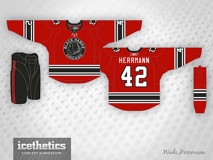
The Blackhawks already wear red, but not like this. Wade Herrmann shares his cool twist on the original Hawks' logo from the 1920s.
Designed by  Wade Hermann
 Wade Hermann


Reader Comments (6)
Very good. But as it is with all Blackhawks concepts- it is hard to beat the real thing.
I like 'em! I would move the numbers on the arms above the stripes to make them stand out more though.
This is great, I love the Hawks' use of red. Their home jerseys are one of my favorites of all time. Combining elements with their black jerseys, this is a very excellent idea.
It probably wasn't meant on purpose, but that shade is more graphite-looking than it is black. But I like it.
Awesome!
Thanks for the feedback everyone. Brian you're right it was an off black color that I didn't notice until you pointed it out. I tweaked it a little following the suggestions in the comments. Hopefully the revised version gets up sometime soon. Again thanks for the feedback on it.