Wednesday
Oct092013
0600: Red Panthers
 Wednesday · Oct 9 · 2013 | 8:00 AM PDT
  9 Comments

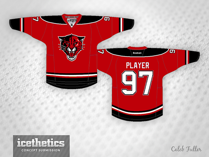
Our landmark 600th consecutive day of concept art features Caleb Fuller and his crimson re-imagining of the Florida Panthers as part of Red Week. This jersey has a very similar aesthetic to the Blackhawks one posted yesterday. Who wears it better? Florida or Chicago?
Designed by  Caleb Fuller
 Caleb Fuller


Reader Comments (9)
Don't like the black on this one. At all. However, I'd like to see this pattern with blue in place of black.
I love the jersey but the logo just looks weird in all-red. Although I do think going to just the panther's head as opposed to the full body is a huge improvement. I'm curious what it would look like if the color weren't changed.
I think this would look a LOT better without the black. Red with black shoulders looks too much like the Devils. Maybe use the blue the Panthers have used. I also think the crest would look GREAT if it wasn't red. I've never seen a red panther. If it used the current colours that the Panthers already use for their crest it would be a big improvment.
This is WAY too New Jersey Devils. Maybe add another color somewhere??
I like this better than the Blackhawks concept the other day, but I'm not a fan. The close-up Panther was great but the fact that it's main color was the same main color of the jersey it didn't fit.
The colors don't work for this. Florida Panthers (the animal species) are more of a gold color. A red panther is just weird. The black and red combo is too common also with the Devils, Blackhawks and Canes all using some variation of that. Stick with navy blue.
Agree with most, the panther head is a plus, but there's just not enough contrast between the logo and body of the jersey. Nice striping and shoulder yoke elements though. To answer your question Chris, Chicago wears it better
I made this a while ago, it was to go along with the Panthers promotion "We See Red" . I was disappointed when only the primary color changed from blue to red and not really much else.
I spent most of the time tweaking the logo, and now that I look at it months later, all I can see is Santa's beard.
As for the color scheme, there are more teams with Red/Blue/White than there are Red/Black/White (Columbus, Montreal, New York and Washington) Although Columbus and New York have blue as the primary.
I may revisit this concept now and I should be able to improve on this.
So far, I've yet to see a good Panthers jersey that isn't red, blue and yellow. It's one of my favorite color combinations, and Florida wore it best from 1993-2007. One of my favorite jersey designs ever. Their current ones are great, too. Their alternate jersey from 2009 was bad. Not as a jersey in general, but with the fact that a Florida jersey should only don their classic color scheme.
Now, this isn't bad. This is a better idea for an alternate than their 2009 one (seriously, who thought light blue was a good idea?...). I like the alternate crest idea for it. Now if there was just a little more color in it...like...this.
http://tinyurl.com/lmxrn9z
For the most part, it's good. Red week has been going nicely so far. I'm pretty sure there's one team that's obviously going to be featured, but only time will tell.