Tuesday
Nov122013
0634: The Jets Set
 Tuesday · Nov 12 · 2013 | 8:00 AM PST
  4 Comments

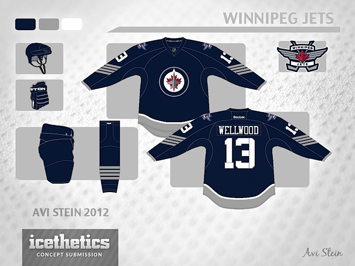
The military theme of the Winnipeg Jets seems to be pretty popular. Avi Stein has taken it a step farther with this minimalist set.

He's even included a throwback-inspired third jersey.

Designed by  Avi Stein
 Avi Stein


Reader Comments (4)
At first I didn't really think much of these, but after a second and third look I find I like this set. I'd be happy to get rid of the double blue, and the navy and silver scheme would be a solid look. One that no other team currently uses. The third is pretty good, although I would like to see a return of the red pants.
The stencil letters/numbers and the chevrons on the sleeves remind me of something the Houston Aeros would have worn. The throwback third is definitely the best of the three.
The blue is a little too blackish for my taste. I'd prefer a more blueish blue. These are too dark. Other than that, sharp concepts.
I feel bad, I submitted a very similar set a few months ago that haven't been published yet; no plagiarism here I swear!
I do think the military approach is a good one for this team, for obvious reason. I love the chevrons. There are good ideas here, although I would look for other typefaces in a similar military style. I'm not sure about the slab font for the nameplates, and I would think the stencil lines would need to be a tad thicker in order to be seen from afar (not too thick though, or else the numbers becomes hard to read). But the idea is there.
I've never beed a fan of the lighter blue on their current set, so I'm fine with the color scheme, even though the blue might look too dark under under specific lighting. But that's the kind of details that's not necessarily taken into account when designing new concepts.