Wednesday
Nov132013
0635: Dual Blue Nordiques
 Wednesday · Nov 13 · 2013 | 8:01 AM PST
  6 Comments

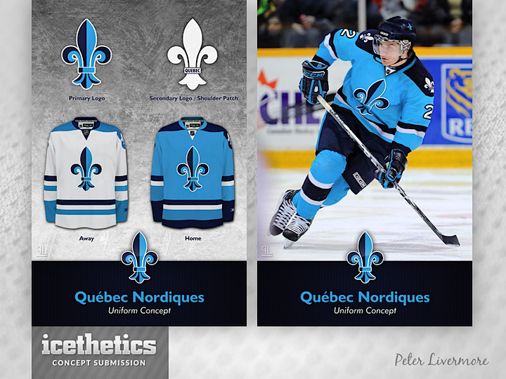
It's always fun to feature a sharp Quebec Nordiques concept. What do you think of this one by Peter Livermore? Here's what he had to say about his design:
I wanted to incorporate some elements from the early 90's Nordiques uniform and the stanley cup winning Quebec Bulldogs uniform from the early 1900's, all the while creating a fresh look for the team. Hopefully I accomplished that.
Designed by  Peter Livermore
 Peter Livermore


Reader Comments (6)
That would be a must have for me ... awsome and excellent design ...maybe the shoulder patch could be different from the prime logo ....
Nicely done! I'd have stuck with the original Nordiques blue, however; 'nationalist' sentiment there would demand it.
These are good but the original Nordiques jerseys are perfect and can't be improved on. Quebec Nordiques had the best looking jerseys ever worn in the NHL, and I'm saying this as someone who was not a fan of the club.
Looks really good. If anything, I think the Milwaukee Admirals would be better served by adopting that brighter shade of blue.
KRENDELEV - The original Nordiques jersey was fantastic, but with Tampa and Toronto both doing a simple blue and white jersey well, a new Nords team wouldn't have quite the unique identity they would like.
I like the detail on the Fleur-de-lys, but I think it would be more suited to a shoulder patch. Perhaps for the front logo you could use a version of the old igloo logo.
I think that this is incredible. Simple and classic - a perfect update. I love the fleur de lis logo. My only major knock against the old Nordiques jersey is that I never liked the logo.