


Wednesday
Nov062013
0628: Retro Blues
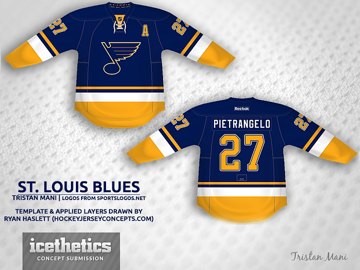
Haven't seen a good Blues concept in a while. What do you think of this retro look from Tristan Mani?
Update on Wednesday · Nov 6 · 2013 | 8:30 PM PST by
 Chris
Chris
Chris
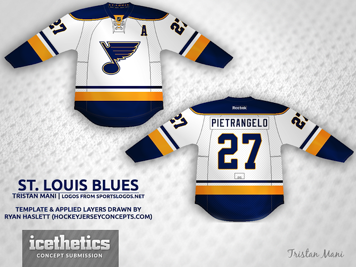
Tristan read your comments and created a white jersey to complete his set.
Designed by Tristan Mani
Tristan Mani 
Reader Comments (26)
Where can I buy one!!!!!
How about a road version?!?! Love this!
Love it! Not a blues fan at all...but this sweater is great!
This might be the best concept I've seen on this page to date. Bravo, Tristan!
LOVE IT! Would LOVE to see the Blues use this, I really like to see a concept of the 70's Blues uniforms!
Coming from a Hawks fan that downright despises the Blues, that is one heck of a fantastic look.
I think it's safe to say the blues COULD easily have the best sweaters in the league. So many amazing Blues concepts on this website, I wish they would realize what could be.
Awesome. So much better than that mess they're wearing now.
Wow. That's a beautiful blue. By making it darker, the artist makes the Jersey look modern with a retro feel as opposed to being a retro/throwback jersey. By far one of the best concepts I've seen. The Blues should take a seriously look at this.
Yup, that there is uni set to be proud of. Make it happen Blues.
(Note: this is coming from Sabres fan.)
This one really hits the mark as a concept. I agree with others that these unis would make a great primary set for the Blues.
Tristan,
I don't know about anyone else, but I tweeted the Blues directly about this concept. You deserve to have them see this. THIS is what the blues should be wearing. These are gorgeous. Amazing work!
-Big Jim (@BigJimSports)
Hm. Personally, nothing initially came out to me about this concept. It's not bad by any means. But looking at it more, and especially seeing the road version, I really like this concept. I'd miss their current home/roads that are based off of their 1998-2007 uniform set, but I wouldn't be mad at all if this was their new set, especially if it means making it less Edge-looking. Overall, this look seems to be a mix of modern and classic Blues identities, with a nice dose of yellow added.
And hey, why not a shoulder patch, too? I'd like for them to revive their old one they used for a few years in the late 90's with those wacky blue/red/yellow uniforms I love so much, albeit minus the red since it's not a team color anymore. Something like this.
I'm anticipating what the Blues say to them, Jim. I'm hoping at the very least they reply and say they like it.
Reebok can seriously take a page out of some of these concepts and use them... This Blues concept is amazing!!
These are perfect. 'Nuff said.
One word: Incredible. Love everything about it.
Perfect.
personally i think there is to much yellow in the dark jersey. but i will say i would be happy to buy the white one. it would go nice with the 26 blues jerseys i have.
That white one is a top five all time concept for this site. Maybe even numero uno. Exactly what a hockey jersey, no make that sweater was meant to look like. Not taking anything away from the blue either, it's damn fine. There are so many talented designers on this site, and it must turn their stomachs to see the utter garbage Reebok and especially Nike are putting out. Someone more computer savvy than me needs to start the movement online for the Icethetics designers to redesign the whole f'n NHL and olympics too.
The white Blues concept is the best concept I've seen on this site. The artist's use of the gradient/lighting effect just makes the uniform pop. Well done. It's a perfect set.
Not bad. Would it be possible to see the white and yellow switched on the blue jersey? Coming from a Blues fan, the Edge ruined a great jersey.
OMG! I really love this concept. Blues management really needs to move away from the road construction worker theme currrent Blues uniforms. Please use this concept! It totally rocks!
These are incredible! I'm a die-hard Blues fan & I want these to be on the ice next season. My only complaint is I've only now seen them, two months after their debut!
Can u do the leafs wow dats amazing
These are by far the best Blues jerseys I've ever seen. My only thing is that the white one is cutting it close to the sabres jerseys, however, these are still by far 1000 times better then almost anything in the league currently!