


Tuesday
Nov052013
0627: Fixing the Jackets' Third
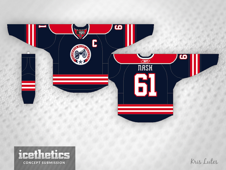
Not everyone is a fan of the vintage white-infused Columbus Blue Jackets' third jersey. So Kris Lutes created a different option with more red. How do you like the use of the Ohio state flag striping?
Designed by  Kris Lutes
Kris Lutes 
Reader Comments (12)
Curious...when did Nash re-join the 'Jackets?
It looks great, but it takes away from the intended tribute to the Union Army that was in Ohio by removing a color that was in their uniform for one that was not. I'm not a fan of blue on blue because I'm backlashing against the trendiness of it, but it made sense for that purpose with the Blue Jackets.
Love the jerseys. Not so much the logo.
I'm a diehard CBJ fan and have never been a huge fan of their third. It's OK, but always wished red was infused somehow. I like this look. I also like the number font. I'm not a big fan of the blocks they use now. Maybe thro the primary logo on the shoulders; they look a bit bare.
Change the nameplate font to something more easily read and this looks better than any jersey they've ever worn. Hopefully not with red pants though. I realize the font is the one they've always used but I've never liked it.
Put the main logo on that and add a white version and those could be the main jerseys!
Love it! Should be the primary.
I don't comment much, but does the player on the back have to be Rick Nash? It's been a full season since he suited up for the CBJ. Generally, I'm interested in seeing less red for the Blue Jackets, but I love the Ohio-Flag style striping. I like the shoulder yoke, too. Aw, hell, the red looks good.
I think a less thick stripe on the waist would be better. Maybe just red-white-red there.
Haha, wow. So I guess you guys (Rob and Sean, namely) will only avoid commenting on the names if I call you out preemptively like I did yesterday with Alfredsson. Think a bit. If the player shown is no longer with the team, you're probably looking at a concept that was submitted sometime in the past. In this case, Kris actually sent this back in 2011.
I'm trying this week to get to teams that haven't been featured on the Concepts page in a while. I wanted to get the Blue Jackets up but I haven't received many recent concepts so I dug into the archive a little.
Excellent, much better than the original. Firstly, because of the location-inspired identity, it's always a plus. Secondly, it looks better. I'm not the biggest fan of vintage white...it looks alright, but regular white looks better. The red looks great too, and more CBJ-ish.
Ignore the Nash name on this one as well