0683: The Stick in the Rink
 Tuesday · Dec 31 · 2013 | 8:00 AM PST
  8 Comments

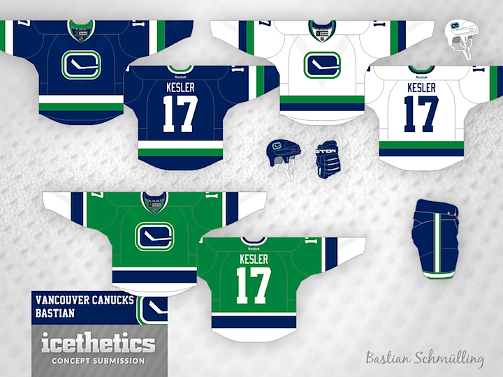
We're riding out 2013 with the Canucks today as part of Tampa/Vancouver Week. The Lightning are in Vancouver tomorrow — one of only two games taking place in the NHL. (Any guesses what the other one is?) The theme today, as you may have guessed, is the Canuck's retro stick-in-the-rink logo. It's featured on every design today, including this one from Bastian Schmülling. I particularly like the green option.

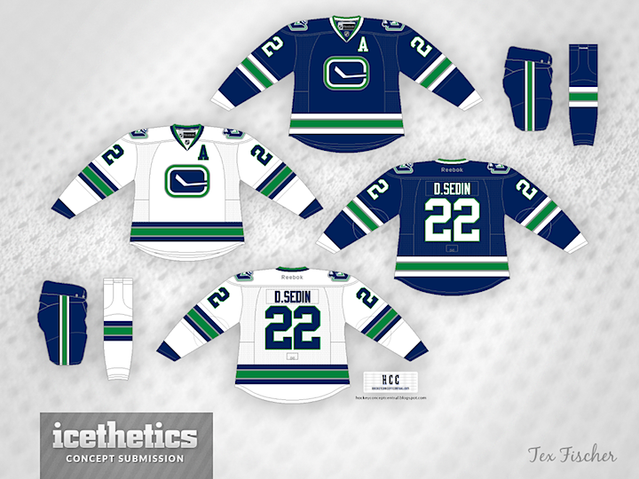
Tex Fischer brings us a more subdued set. But I think that crest can make any sweater stand out.

Finally, Brendan Anderson envisions a minor tweak to the Canucks' existing third before making a home and road set out of it. All three designs have unique aspects and prove that this could be a great, timeless look for Vancouver.
 Bastian Schmülling&
  Brendan Anderson&
  Tex Fischer


Reader Comments (8)
I LOVE the stick-in-the-rink logo and feel that they should ditch the C-Orca. All of these designs are great; I love the subtle "V" in Bastian's road white.
I always loved the "V" on the sleeve stripe. Very unique. I don't think any other team has tried anything close to this.
The original jerseys from the 70s, though, were not that great. I thought the stick was always too thin on the logos making it just look like a box (the retro ones with the slight slant are much better). And the second versions of the 70s blue jerseys, with two white stripes surrounding a dark green one, always looked like a copy of the old Leafs jersey especially on TV.
I really like Tex's design, except for the cuffs. Keep them solid blue or solid white, and use it on both home and away, like in Brendan's concept. Otherwise, throw in a green third that matches the set and you've got a perfect long-term solution for the identity-crisis Canucks.
These are solid, but I'd prefer the original 1970 stick-in-rink logos than the modified ones
Subtle V on Bastian's looks great! Nice work!
Tex's is classy, but I like Brendan's set best overall.
Eh. None of them of them are exactly mindblowing. Pretty standard stuff. I too like the idea of a green alternate though.
I agree with db123 on the original stick in rink, maybe make the stick a bit thickerhowever these are all great jerseys
Love Tex's design. I really like the way he incorporated the silver trimming into the striping without making it stand out like an additional colour. Most of all, he used the correct font - block-style with green accents around the numbers. THAT is the kind of font the Canucks need to return to.
Brendan's design is also very nice but the corporate Agency font has to go.