Monday
Feb112013
0359: The Canadians
 Monday · Feb 11 · 2013 | 9:00 AM PST
  11 Comments

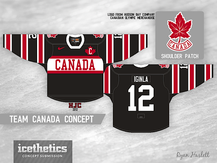
The 2014 Winter Olympics in Sochi, Russia are now less than a year away. So in that spirit, this is International Week on the Concepts page! All week I'll be featuring a variety of national teams. We start today with Ryan Haslett's take on the defending gold medal champion Canadians.
Designed by  Ryan Haslett
 Ryan Haslett


Reader Comments (11)
I don't like wordmarks as logos, however, I have to say this is AMAZING! As a canadian, I would live to see the team wear this in Sochi and wiouldn't hesitate to purchase one either. Great job, Ryan!
id buy this in 2 seconds!
LOVE the shoulder patch. The only change I would make is to have the stripes on the front the same colour-order as the ones on the sleeve. Other than that, this is a fantastic design.
Canada's colours do not include black; not sure why its the dominant colour on this jersey. Would love to see it in red and white with splashes of black
I do not think Canada should have black shirts , but I still like the design , so it gets the thumbs up !
I've been hoping Canada would return to the dark side since they ditched the black a few years ago, this would be an awesome way to do it!
As much as I think this is a cool design, I just can't envision the guys wearing anything but the uniforms from 2010. Absolutely picture perfect. At least except for the placement of the "C" or "A"
But do non-captains/alternate captains get the maple leaf on the front?
Great idea of putting the maple leaf on the Captain's C (or A). Great sweater layout, but would prefer red and white versions with black only as an accent color. I would also like it with a two-color number/letter kit.
But those criticisms aside, great jersey! Black would look stunning as a third jersey!
This really does look like something I would see at The Bay. Love it!
Regarding Non-Captains not getting the Maple Leaf on the front, their's would simply not have an "A" or "C" inside it.