Entries in international (32)

Sunday
Jan262014

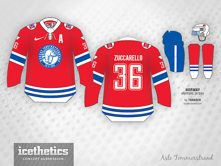
0709: Norway by a Norwegian

Here's a series I'd like to expand on as we near the Olympics. Concept artists creating jerseys for their own national teams. Norwegian Asle Tømmerstrand tackles his home country's jersey today. And while IOC rules may not permit the bear on the front, this is sharp sweater, isn't it?

Also, if you're an Icethetics reader outside of North America and have a concept in mind for your country, send it along! I'd love to share it here.

Sunday
Jan192014

0702: Latvia in Sochi

With the Olympics now only weeks away, we're wrapping up Eric Westhaver's extensive international concept series today with his take on Team Latvia. Here's his description:

How can you not like a country whose flag looks like bacon? Seriously though, the flag features heavily and some traditional Latvian designs can be seen on the shoulders and cuffs. The numbers and letters have a subtle 3D effect (or drop shadow) as well.

Eric has also designed uniforms for the Czech, German, Swiss and Japanese teams. I hope to share them here between now and the end of the Winter Olympics, but I want to showcase some other artists for the next few Sundays.

Sunday
Jan122014

0695: Finland in Sochi

It's been a treat these last several weeks to see the various creative jersey designs Eric Westhaver has put forth for the countries being represented in Sochi next month. Today is no exception as he deals up a fresh look for Finland. See his comments below.

Simple, traditional. Another sharp look with a lot of contrast for a team steeped in history. Although all three jerseys look old, they are completely original creations (besides the logos, obviously).

We'll wrap up Eric's Sunday series next weekend with the Latvian team.

Sunday
Jan052014

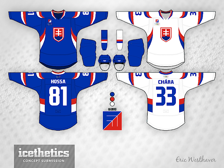
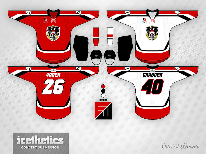
0688: Slovakia & Austria in Sochi

On this International Sunday we're treated to a two-fer from Eric Westhaver. First, take a look at his redesigned uniforms for Slovakia. Not much can compare to having the words of your national anthem built into the striping pattern, but this is a pretty sharp look too. Eric's comments follow.

No real significance for the Slovaks. I just figured with their bright colors that these kind of large, sweeping stripes would look pretty damn good.

Eric also brings us his look for Austria. Another solid one. He writes:

Since the Austrians haven't been in the big tourney for 12 years, I figured some new ideas like the angular stripes and italicized font could work.

Check back next Sunday as Finland gets the Westhaver treatment.

Sunday
Dec292013

0681: Slovenia in Sochi

For the last of Olympic concept of 2013, Eric Westhaver gives us his take on Slovenia's national team. It's a very creative design. Here's how he came up with it:

Slovenia's national soccer and basketball teams both use green and blue instead of red and blue. Why shouldn't the hockey team do the same? It's distinctive and, if the colors weren't enough, the arm and front stripes — based on the mountains in the country's coat of arms — certainly are.

Sunday
Dec222013

0674: Russia in Sochi

Better late than never, right? As Russia hosts the 2014 Winter Olympics, you might wonder if they could improve on the jersey Nike gave to them. So continues Eric Westhaver's series. Here's his write-up on the design choices.

Say what you want about the Russians, but no one disagrees with their place at the rink. Internationally, only one country has done better (three guesses who). Since I always thought of Russia as a highly industrial nation, I wanted to throw that in with simple chest stripes, a square stencil font, and a print eagle on the back. The third is a throwback to 1954, their first international title.

Sunday
Dec152013

0667: Sweden in Sochi

If you've been unhappy with the new national team jerseys come from Nike, you've got to be excited to see what Eric Westhaver has been doing the last few weeks. His Olympic jersey concepts have been pretty spectacular if you ask me, and he continues to hit the mark with Sweden this week.