Monday
Feb252013
0373: Grey Monday
 Monday · Feb 25 · 2013 | 9:00 AM PST
  9 Comments

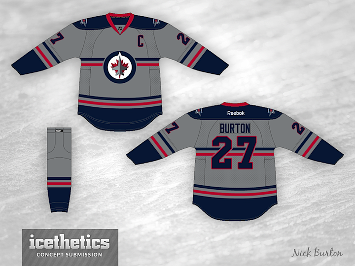
You don't see a lot of grey jerseys in the NHL. Or any, really. So Nick Burton's Winnipeg Jets jersey would be one of a kind. What do you think?
Designed by  Nick Burton
 Nick Burton


Reader Comments (9)
I think this looks great!
i really like it. but while the gray is a bit on the dark side it might be too 50%. too light to be a road jersey, too light to be a home one. i'd like to see the gray just a little darker to make it a clear home sweater. hell, maybe make a silver version as well for the road.
It's not white, it's not black, it's somewhere in the middle! It's grey!
It is an interesting look but I don't know how it would look as a real jersey. Also, would it be a home or an away jersey?
There's a good reason you don't see grey jerseys.
I would of givin it a more metallic grey. Still, nice concept though.
Would love to see some white striping thrown in there to brighten it up a little. Solid concept though!
I like that it's just a tad on the dark side, like Bickleton said too dark for the road and too light for home. But it's everything a third jersey should be.....unique and tasteful, as well as outside a team's usual colour palette, but without being garish. Overall I think it's one of the best concepts ever to grace this fine site. As for other grey jerseys, the only one I can recall is the OHL Sudbury Wolves' third a few years back. It had mainly blue trim with a bit of white, (not to mention the dreaded diagonal text logo) so was quite dull. The red is what makes this one pop. Well done!
As others have said, the grey should be shifted either lighter or darker, but overall it works. I also think the horizontal stripes behind the Jets logo makes the logo much less bland. The red stripes also make the maple leaf pop more.
Attention Winnipeg Jets: make this a third jersey now.