Tuesday
Feb262013
0374: Long Live the Lighthouse
 Tuesday · Feb 26 · 2013 | 9:04 AM PST
  13 Comments

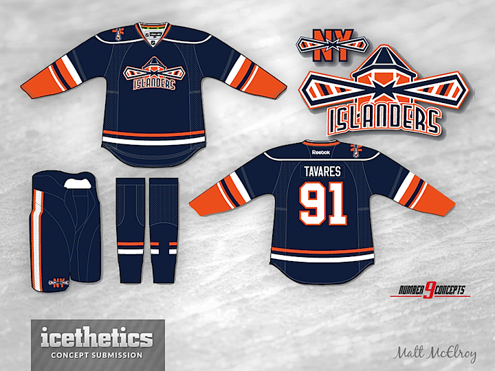
I know the Islanders get featured here an awful lot, but a good concept is a good concept. And this one by Matt McElroy is very good. I don't know why the Islanders have never tried to pursue a lighthouse logo again. Did the 1995 rebranding debacle leave such a bad taste in everyone's mouth that they dare not suggest anything good might have come of it? A third jersey would've been the perfect place to test the waters of a new secondary logo. Instead, we got text on a black jersey — the two biggest no-no's in the third jersey world.
Designed by  Matt McElroy
 Matt McElroy


Reader Comments (13)
I like the current look but I feel like more teams need to build a new look than just borrow one from their past and this is a good example.
Neat logo. It combines lots of elements of the Islanders' history in a fresh way without completely rebranding and alienating what came before. Well done!
Please god, no more socks with incomplete line patterns !!!! IT'S UGLY AND USELESS !
Not bad at all. I like the attention to detail by including the four stripes within the beams of light,
The lighthouse looks like it is wearing a bow-tie.
Absolutely fantastic. I've seen the isles concepts a lot and none have really wowed me like this one. Extremely well done in all aspects.
Nice logo. Some form of a lighthouse logo makes perfect sense. But enough already with the four stripes=four stanley cups! Why do all Islander concepts always seem to include this? Do the Canadiens have 23 stripes on their logo?
This concept makes me want to cry its soo good.
My only things to pick at are:
The Text: Increase clarity by reducing number of outlines, or reduce thickness of the white outline, and remove the portion of the logo behind the text
The Jersey: Im a big fan of the jersey they have now, and I think this could be brightened and a little simpler, but I have no suggestions on how to do that.
But all this nay-saying is not to discredit this concept, just constructive criticism.
This is far and and away one of the best Isles concept and executions!
SAAAV
nice. i like the lighthouse as an alternate logo. the thing that's really got me going though is the asymmetrical shoulder patch. i can't decide if i love the idea or hate it, but i know i can't look away from it.
what font did you use?
I think this is a pretty solid concept actually. I wouldn't mind seeing this. I like the simplicity of the jersey and am totally ok with the navy blue returning. I kind of think the font looks like the McDonald's font of the late 90's, it's a tiny bit similar. I also noticed the bow tie thing first off. But I have no idea how you show light, so I give huge props for the design. As for the 4 stripes on each side, I think it makes it look awesome, as much as I am tired of what it stands for.
That being said, I truly do hate the Islanders more than any other team and am very tired of seeing them. Everything that team is and does makes me angry.
As an Islander fan: nopes all around. I'm tired of seeing concepts with navy blue or black. Too many stripes. If you ask me, it looks more like a silo than a lighthouse. People can't seem to grasp that the Islanders don't want new logos anymore, even if its a third jersey. Also, stop with the nautical themes. Anchors, lighthouses, fisherman, etc.
the socks could have four stripes on them like on the old jersey to commemorate the 4 Cups. The lighthouse idea would have been a good concept to follow, people love lighthouses... maybe now with the Brooklyn move they could use a crack house?