Tuesday
Feb052013
0353: Minnesota's Wilderness
 Tuesday · Feb 5 · 2013 | 9:00 AM PST
  10 Comments

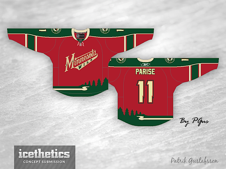
Patrik Gustafsson takes a stab at the Minnesota Wild today. It's an interesting look that borrows elements from the primary logo to create the striping pattern for the bottom of the jersey.
Designed by  Patrik Gustafsson
 Patrik Gustafsson


Reader Comments (10)
yeah, it is nice and all- i especially like the logo with the stars- but i can't stand it when jerseys (especially hockey jerseys) have design elements like that. sure, it can help set you apart from other teams in the league, but it just seems so.... gaudy. (maybe that isn't the right word.)
when i look at new uniforms, i often think about how it would look if it was placed on one of those "team uniform history" posters and then i think "could this uniform have been made 50 years ago?" in this case, i don't think that design elements like the trees on the bottom fit into the "will this look good when we look back at it in the future?" (i think the "burger king" jerseys that LA wore at one time lend an arguement to the "keep it simple" defense.)
I get why people wouldn't like it, but I love this - it's not often you see a logo turned into a striping pattern. It's a really clever design, without straight up making something new. I also am surprised how well the script logo works on red. This would make a really fun 3rd!
Really neat idea! It has a 90's kinda feel and we don't see that a lot. I like it!!
I love this, although I'd like to see it with regular green shoulders instead of the green going all the way down the sleeve.
awesome jersey! I like how the pattern is interesting and playful, but yet not too cheesy.
i love it but id like it with the wild head instead of the wordmark
Love the waist area, but it don't think it matches the rest of the jersey stripes that much. Still very nice, nonetheless.
It feels like the coyotes green third from years ago i love it
Very nice! Love the striping on the bottom. Very unique and creative. I've seen a lot of great Wild concepts, and although this isn't my favorite, it's still a very good design!
I love this concept as a third jersey. I love the primary red. I also love the sleeves with the solid green on the outside and then the horizontal stripes. I am not a huge fan of words marks or just spelling the name out, but you really have to go with it on this jersey. The primary logo on the chest would be to much. The logo is included on the shoulders so I am very satisfied with that. Love it or hate it or anywhere in between, your use of the wood line and the Mississippi river for bottom stripping are very creative and work very well on this jersey. I really like it and would absolutely buy it and wear it. Stick tap to you for one of the most creative ideas that I have seen on here.