Wednesday
Feb062013
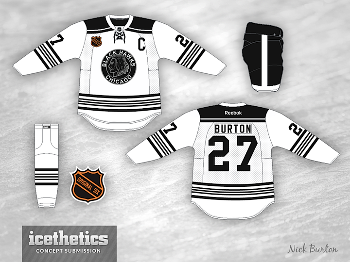
0354: White and Black Hawks
 Wednesday · Feb 6 · 2013 | 9:00 AM PST
  4 Comments

Nick Burton brings us a couple of Chicago Blackhawks concepts today based on the black-and-white color scheme the club wore during its first eight years of existence. They are pretty sharp and, if you ask me, pull off the colorless palette much better than the Kings do.

Designed by  Nick Burton
 Nick Burton


Reader Comments (4)
Great stuff!
either one would make a great third jersey
Love the Original Six idea. Would kill to see Montreal dust off the Globe logo from 24/25, or a Maroons tribute.
Sorry, but the black/white/silver combination IS the Los Angeles Kings. And there's a reason the Blackhawks added red to their color palette. It just doesn't work here. The jersey is WAY too busy. The Kings' current look (and their 1988-98 look) is how you make it look good. Not too busy, the right amount of striping, and an overall clean look. I don't think these concepts accomplishes that.