Monday
Mar112013
0387: Black Devils
 Monday · Mar 11 · 2013 | 9:54 AM PDT
  19 Comments

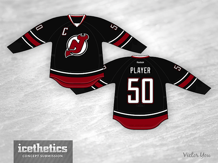
Today, Victor You offers his take on what a black third jersey would look like for the New Jersey Devils. It's a little plain, but that may be just the thing for the Devils — who have never had an alternate uniform in more than 30 years.
Designed by  Victor You
 Victor You


Reader Comments (19)
BEAUTIFUL!
While this jersey might be a little plain, it's also really nice. While there are a lot of black jerseys that feel like they're black for the sake of being black, a black Devils jersey makes a lot of sense. Adding some shoulder patches might liven this up, but I don't know what the shoulder patches could be. The Devils had an unused alternate from the 80s that might work if it's re-coloured. Either way, I'd have no issue with the seeing the Devils wear this 10-12 times a year. Good work, Victor.
I'd love to see a black Devils jersey. But the reason is because there are a few teams that toss black into the mix purely because it's "trendy". Since black is part of the Devils color scheme, something like this would look fantastic and also relevant.
Very nice!
While I like the creative touch of the sublimated flames on the cuff, it seems unnecessary. The New Jersey Devils are NOT named for the demonic, hellish spirits of the underworld. The name is attributed to the urban legend; the Jersey devil. So the fire is superfluous.
But the rest of the concept is solid. I always knew the devils would look great in black!
Good Job!
If the Devils ever decided to go with a permanent third jersey (their retro look notwithstanding), then this wouldn't look out of place.
The concept looks really good and it would be nice to see Devils in a third jersey, 5 stars from me!
That looks really sharp. I don't want to say it's too plain, because it isn't, but I think it could benefit from a red shoulder yoke much like what they currently have on both uniforms just to give it a little bit extra color. But this is as close as anything to how you make a black and red jersey work to perfection.
sometimes simple or 'plain' designs are the best, think this is a very good example of that. one thing i would like to see, is a different logo, a horned 'D' perhaps (and use the NJ as a shoulder patch)??
Phenomenal. I have been thinking about something this a lot lately, like a black Devils' jersey and a black Flames' jersey. Great job by the designer.
Not bad. Get rid of the sublimated flames on the sleeve. Put the "C" on the proper side.
Would love to see some hunter green added in, but a nice attempt. And by the way, the captain's C is on the wrong side... Oops
the "C" is on the wrong side, it should be on the side of the heart. Just pointing that out, although, I don't know if it is mandatory.
Just so everyone knows the C can be on either side, for example the redwings have it on that side because the way the logo extends into that part of the jersey. I see the same problem with the logo on the right here so I am all for it on the left.
I would argue that the retro-jersey used by the NJD on St Patricks Day is an alternate uniform and works fine. Black is/has been just overused and is good that it isn't in much play right now. I like the concept, but better for 15yrs ago.
Meh. It's not that it is a poorly-designed jersey, because it isn't. All things being equal, it's attractive, but I'd keep the big fat number font they currently own on their sweaters instead of this SD Chargers-ish/two-color Canucks-ish font. But personally, for me, if the Devils are going to have alternate jerseys, I say stick with the Christmas-color throwbacks. I frakkin' love those things. The NHL could ALWAYS use more green.... I'm also of the opinion that teams should not use black jerseys for black's sake. The Flyers 98-07 black set? Beautiful. But should they design a black third now that they have these awesome creamsicle and reverse-creamsicle home and roads? Not so sure. The Devils are one of those teams that just has a RIGHT jersey. Hard to improve upon it. Like the Habs home reds... Perfection should never need a redesign for the sake of staying fresh/current. Now if only the Habs would go to the 1940s reverse of their red home for their white road (I know, sacrilege to some....)
I am so tired of black jerseys, HOWEVER, this version is pretty damn good. It's simple, it's classic, it's totally NJD. Now, just move the "C" where it belongs and you're all good (enough of the "C" on the left side)
This is aimed at Jeremy if he sees it. Do you have a link to this un-used Devils alternate from the 80's?
Suhweet. Kevin Smith would be proud.
I think this would make a sweet 3rd jersey. Awesome!