Wednesday
Mar202013
0396: A Rare Habs Redesign
 Wednesday · Mar 20 · 2013 | 9:00 AM PDT
  8 Comments

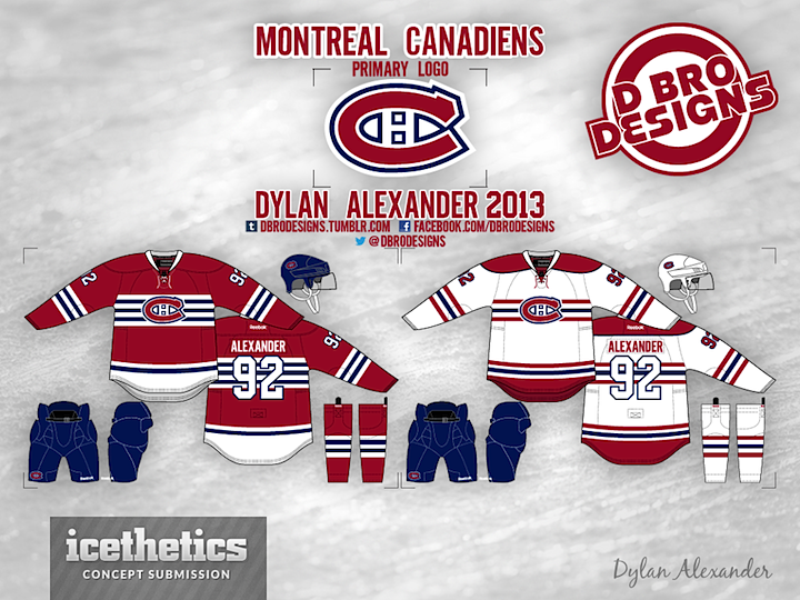
It's not often the Montreal Canadiens grace the Concepts page. Their uniforms are pretty much perfect — and the epitome of what every other NHL team strives for — so why bother? But if the Habs ever did want to change it up a bit without losing their identity, Dylan Alexander has a pair of jerseys that would fit the bill. Or so I say. What do you say?
Designed by  Dylan Alexander
 Dylan Alexander


Reader Comments (8)
the white isn't bad, but the red just ends up being way to stripey.
I think the way the are now is great, but the only thing I would do is def add the middle striping to their whites. Always liked those, and Northwestern Wildcats football has a great uniform now, I think that color scheme and style would look great on an NHL uniform.
Looks to much like the Blackhawks. nice try though
This would look great, if the stripes moved down a bit, and if the Habs crest was larger. Then it'd look fantastic.
Switch the red and white bottoms and these are the best jerseys ever posted on this site.
The white is really good, but the red one does look a lot like the Blackhawks'. Maybe make the blue stripes the border stripes?
NO. The changes to the logo, the stripes... It doesn't look terrible, but it's just wrong period.
Don't mess with Perfection. Way to many stripes Habs jersey should just be left alone.