Monday
Mar252013
0401: Metropolitan Mania
 Monday · Mar 25 · 2013 | 9:00 AM PDT
  7 Comments

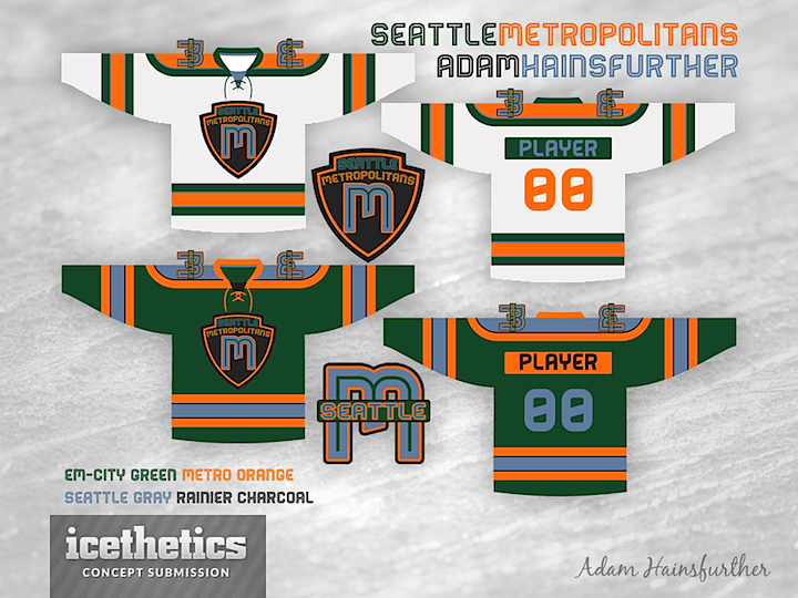
Feels like time for another theme week to me. And for a trip down memory lane. Once again we resurrect dead pro hockey teams. Today, it's the PCHA's Seattle Metropolitans via Adam Hainsfurther. I particularly like how he's given each color its own distinct name — sort of the way the Blue Jackets did.
Update on Saturday · Apr 13 · 2013 | 4:43 PM PDT by
 Chris
Chris
 Chris
Chris

Following this original post, Adam has put together a revised version with a third jersey and some new logos.
Designed by  Adam Hainsfurther
 Adam Hainsfurther


Reader Comments (7)
Logo's a little dark...hard to discern the "Seattle." And are those numbers zeros or eights?
Can't really say I'm a fan.
Like the colour scheme, especially works on the white jersey. Not a fan of the numbers, font, nameplates and logo though. There is definitely something here to build on.
It's a neat idea, and I really like the colors, but much like the Sharks, I think the jersey is too classic like for what the colors and logo suggest it should be. Everything is nice individually, but put it all together and it doesn't quite work for me.
Like the other Taylor, not a huge fan of the numbers or name font but it definitely works for the logo. The jerseys are definitely going in a unique, modern (almost spacey) direction and I like the layered logo crest you have going on but I question whether they agree with the simple jersey design.
Personally I found that it clashes and there's just too many colors layered on top of one another to be appealing.
I really like the colours, although I think the white jersey should be changed to primarily yellow. I don't like the numbers or the logo though. I think "Metropolitans" is such a lame name it would be hard to come up with a good logo. This logo looks like a crest you would see on the side of a police car which right away makes it bad. I don't mind the font for the names on the back but the numbers need to be changed.
I'm def a fan of these 2. I do have a suggestion tho. Swap the crest with the should patches and vice versa. I think this simple tweak will put this design over the top.
I don't know how I feel about the name 'metropolitans.' I think it would be better for a Seattle team to take a name such as Breakers or Thunderbirds.