


Tuesday
Mar262013
0402: Reviving the Nordiques
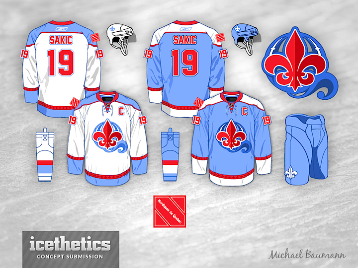
Revival Week continues with Michael Baumann's take on the Quebec Nordiques. Just bring them back already. What are we waiting for?
Designed by  Michael Baumann
Michael Baumann 
Reader Comments (19)
I'm a sucker for old-school logos. I feel that the Nordiques should stick with the old logo, much like I felt the Jets should have used their old logo or at least an updated version of it. I loved (and still do) the old Nordiques sweaters.
What is the story behind the sleeve patch? Is it based off of something special to Quebec or the Nordiques? It's refreshing to see a square sleeve patch, as well as one so simple.
Solid designs but not enough contrast. The jerseys would look better if the blue 'Q' logo on the white jersey was darker (like on the blue jersey), and if the blue 'Q' logo on the blue jersey was white. Also, the blue jersey might benefit from red pants, because it's baby blue from top to bottom like this.
Wouldn't mind at all seeing that for real! Really nice job on the logo!
GORGEOUS!!! Change nothing!
I'm a huge fan of the logo. But not the colour scheme. Baby blue doesn't belong on the ice, in my opinion.
The Nordiques blue was the same as the Quebec flag. This baby blue is ugly.
it is not a bad design, but i think i would like it better without the Q behind the fleur-de-lis. the Q just makes the logo very cluttered looking and more minor leaguish.
I love the idea of Baby Blue on the ice, but I do not like the red used here. It becomes distracting.
Already been said, but should be said again: Logo is great, colors not so much. The best part about the previous Nords jersey was that unique, eye-catching shade of blue. Bring that back! Also what is going on with that shoulder patch? It looks like the logo for a failed political party or a shipping company, not a sports team.
Looks great. Love the Baby Blue!!! Looks fantastic! Colors would stand out from standard blue and red teams in the nhl.
Logo is strong. These would be excellent on the ice.
The only thing for me is that i would love to see some sort of design following the bottom stripes front and back like the old nordiques. Just tough because your logo is the fleur de li, but i think it would be worth trying.
The logo reminds me of the Queens of the Stone Age logo, which is sperm entering an egg, in the shape of a Q... but that's just me...
I'd be interested in seeing this jersey without that weird thing behind the fleur de lis in the logo
I think the "Powder Blue" is going to lend to the team being called the "Powder Poofs". I also agree with some above, I think there's too much complication with the logo - Fleur De Lis - and - the globe - and - the flair on the bottom - to make the globe a "Q" is too much.
Maybe I just like the original too much.
I am a huge Nordiques fans, loved the old jerseys, these might work with traditional Nords blue. Have to point one thing out though... I'm not sure if the designer has been following recent news in Quebec, but the "red square" has become a symbol of civil unrest in Quebec due to it's use in the student demonstrations/riots over the las year, so that patch may have to go.
Reply to ETRUSKEN RAIDER : "What is the story behind the sleeve patch? Is it based off of something special to Quebec or the Nordiques? It's refreshing to see a square sleeve patch, as well as one so simple."
I would think it's a tribute to the "Carrés Rouges" that plagues Québec since last year.. The "Red Squares" (Carrés Rouges) is a symbol used to promote free schollarship in Québec. All the events, brawls and riots in Québec last year were caused by groups of students and the "Black Bloc", an anarchist group in the Province of Québec.. Lots of famous people ( including our current Prime Minister, wasn't last year, http://goo.gl/vBVss ) wore a red square on their chests to support the cause ( http://goo.gl/CBRGa ).
I'll just clear up one point to say that my design for the shoulder patch had no intention of referencing the Carrés Rouges. I prefer to keep political statements out of athletic design and any similarity there was completely accidental on my part and an embarrassing oversight.
The design was meant only to be simple with a modern, bauhaus-style to the stylized "N". The color was simply using the red accent color from the palette.
@BRODA - There is a bit of a callback to the old sweaters here. They're hard to make out at this size, but there are fleurs-de-lis in a darker red running all along the red stripes on the arm cuffs and waist.
Thanks to all for the comments.
LOVE the crest. Unbelievably well-done. I have to agree with one of the previous posters in that I still have a great deal of love for the old logo with the fleurs-de-lis at the bottom, but if they HAD to update it, this would be an incredible logo design!!! Also agree with the particular shade of light blue issue; it should be more of a light cornflower than the pure baby blue seen here. And as for the jersey design, in my personal opinion, it still needs some work. I don't believe in throwing in a contrasting color shoulder yoke just for the sake of doing it; I personally think it should flow with the design, where here, it doesn't. The number and letter fonts are too blah, and I also don't buy into the red striping. But that's probably because I'm a big fan of the original sweater. Hey, at least it doesn't have that Huskie on it like they wanted to do before the Nords became the Avs!!! And yes, I say BRING THEM BACK ALREADY...Phoenix doesn't need a daggone hockey team, and I live close-by. Quebec deserves to have a team.
Great jersey, but if you take out the Q from behind the logo it will be brilliant. Where did you design this?