Thursday
Mar282013
0404: Reviving the Barons
 Thursday · Mar 28 · 2013 | 9:00 AM PDT
  5 Comments

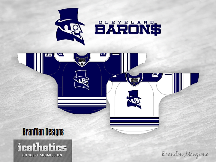
Brandon Manzione moves Revival Week along with this take on the Cleveland Barons. As rebrands go, it's a decent one, but it suffers from the same problem as the Lightning's current uniforms. Many will compare them to the Maple Leafs. Still a neat pair of logos though.
Designed by  Brandon Manzione
 Brandon Manzione


Reader Comments (5)
Great concept and logo. Maybe switch the blue for something like a maroon so it doesn't look like a Leafs copy-cat.
I'm not sure I like the color scheme, but man, do I love the logo. The dollar sign was a nice touch, too. Seems like an easy team to hate!
This looks like it is based a lot on the WHA's Cleveland Crusaders. Just make the primary color purple and the middle stripe black.
Agreed. Logos are awesome, but yeah looks way too much like the Leafs
The Barons were the Leafs' farm team. That's why they had blue and white uniforms. It shouldn't matter anyways because they played in different leagues.