Monday
Mar042013
0380: Sabres and Stripes
 Monday · Mar 4 · 2013 | 9:00 AM PST
  12 Comments

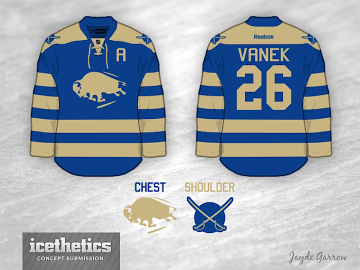
We all know the Buffalo Sabres are planning a new alternate jersey for the 2013-14 season. So that's got the wheels turning for a number of concept artists. Today, I'm featuring Jayde Garrow's faux retro design. I think some splashes of gold are needed to truly make it a Sabres sweater, but apart from that, I kind of like it.
Designed by  Jayde Garrow
 Jayde Garrow


Reader Comments (12)
Not bad. I don't mind the vintage white, but I think there's too much of it here. Adding a little gold may help out. Also, sine it is the team name, I'd prefer the actual sabres as the main logo (like the old red 3rds), and the buffalo on the shoulder. Good idea tho.
The late 1920s-mid 1930s were all about teams having crazy stripes. There's a reason why those jerseys were left in the past. It just isn't a great look.
So Awesome!
I passionately hate the Sabres. I would buy one of these in a heartbeat, if only it weren't a Sabres jersey.
I loooooove using that logo. My only issue is that they are the Buffalo Sabres, not the Buffalo Buffaloes.
For some reason this jersey reminds me of the Nordiques. This is a really nice jersey and I think that if you switched the off-white stripes with yellow and switched the Buffalo with the Sword logo on the shoulders, you would have one hell of a concept.
Yeah Shep's right, Looks fantastic, but if the shoulder logo becomes the main crest, and the buffalo goes to the shoulders this may look better
Switch the logos, throw in a splash of gold and perhaps use a darker blue (too much baby blue going around) and it's perfect!
I think these jerseys are fantastic. Great simple two colour look. I don't like the vintage white however. Regular white would be better. But as it's the sabres, I think if they were just blue and gold, the sabres' colours, then these would be perfect
Not a bad looking jersey at all, but it needs gold. Also, the first thing I thought when I saw this after the home page is that it looks awfully similar to the Millionaires jersey Vancouver is using on the 16th.....
Keep the white Buffalo logo. make the white stripes - yellow. Have to have yellow in it - otherwise we will look like the Leafs. Keep the the swords on the shoulder and put it inside of a circle but don't fill in the circle so looks like swords laying on a puck. Or have the swords on its own - no circle-no puck.
Love this concept. Only thing I would add to it would be a price tag and an order link.