Tuesday
Apr162013
0423: Ice Cold Avalanche
 Tuesday · Apr 16 · 2013 | 9:00 AM PDT
  9 Comments

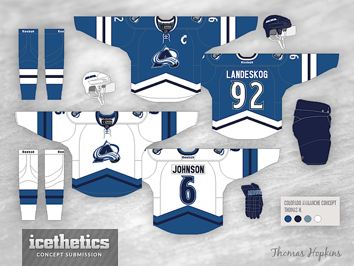
Thomas Hopkins gives us a very cold-looking Avalanche concept today. All those blues are making me very chilly. Brrrr.
Designed by  Thomas Hopkins
 Thomas Hopkins


Reader Comments (9)
I'm interested in seeing what the road set would look like if the navy and light blue were switched on the jerseys and socks. I love this color scheme and striping.
Great look! I'd be curious to see this design using maroon.
I like the idea, but I really love the maroon on the jerseys right now and how it looks with the blue. I don't like the current layout of their jerseys, so this is a big upgrade, but it's missing my favourite maroon!
Definitely a step in the right direction in regards to simplifying. I agree with the rest that the addition of Maroon, a sort of unique color in the NHL, would greatly improve this already slick look. I'd try adding the maroon as an accent or primary color to see what the results produce! I like the thought of replacing the current Black with the Navy Blue in an effort to simplify the color scheme. Tri-tone blues, Maroon, and white = there you have it!
I like the sweater, but think the logo on the front should be the existing logo, as opposed to the recolour shown. Keep the look of the sweater as it is shown, just substitute the current colours on the logo. The Nordiques did something similar, using only blue on the sweaters but red on the logo, so it would work beautifully. Excellent work.
It's a good design, but it just doesn't say Colorado Avalanche without the BURGUNDY and STEEL BLUE.
The blue and white gives me a very strong Nordiques vibe, which is a great feeling! This would be an excellent 3rd for them, giving a little love to their roots!
This design is AMAZING. If you could incorporate some maroon in here (while keeping everything else the same for the most part, even the 2 tones of blue), this would look NHL ready.
Something about Colorado's color scheme has never looked right to me. Burgundy and blue just don't work well together in my eyes. This is a step in the right direction.