Entries in Thomas Hopkins (7)

Monday
Dec162013

0668: Around the AHL

i
449 VOTES

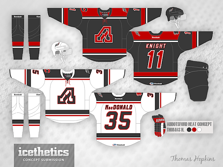
Welcome to Minor League Week on the Concepts page! And just to get really crazy, we're doing individual theme days within this theme week. As you can see, today is about the American Hockey League. Thomas Hopkins gets us started with this clever use of the old Atlanta Flames logo for the Abbotsford Heat. I think a grey and red team would look fantastic!
i
371 VOTES

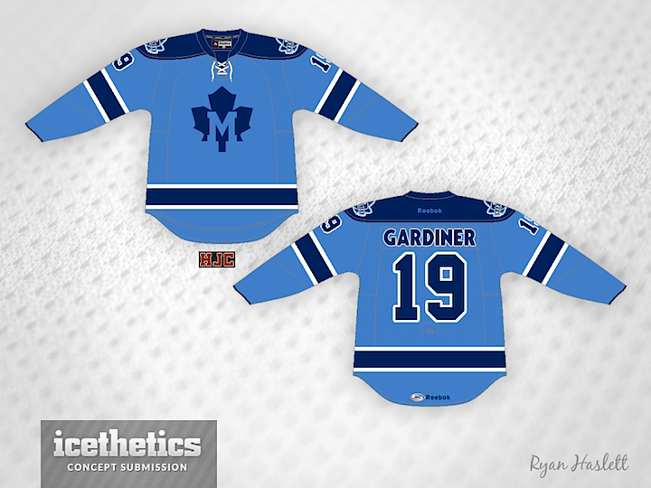
Ryan Haslett decided to get a little creative with his hometown Toronto Marlies, creating a new crest to go with his two-tone blue sweater. Another solid one there!
i
344 VOTES

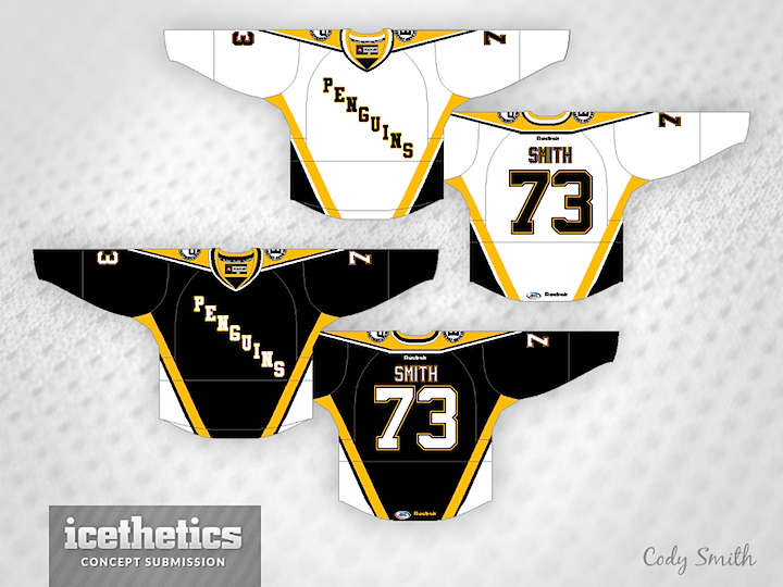
A newcomer to the Concepts page, Cody Smith reimagined the Wilkes-Barre/Scranton Penguins a little with this wordmark-centric uniform set. The throwback to the Pittsburgh jersey from the '90s saves it.
i
370 VOTES

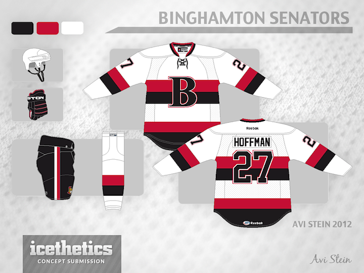
And we'll wrap up with Avi Stein's idea for a Binghamton Senators third jersey. The "B" works just as well as the "O" there — if not better!

Tomorrow we'll see some of the entries to the ECHL's 2015 All-Star Game jersey design contest.

Thursday
May232013

0460: Dallas Stars IV

i
517 VOTES

We know the Stars are expected to introduce new logos in a couple weeks, but it's likely the slanted star form will continue to be incorporated somehow. Thomas Hopkins basically kept the logo the same but redesign the sweaters with a lot more green and gold.


i
490 VOTES

Todd Varga, on the other hand, stuck to black and white jerseys, but increased the amount of green used. I can honestly say I like this version better. Might be the simplified logo. I'm a sucker for simplicity.

Tuesday
Apr162013

0423: Ice Cold Avalanche

i
732 VOTES

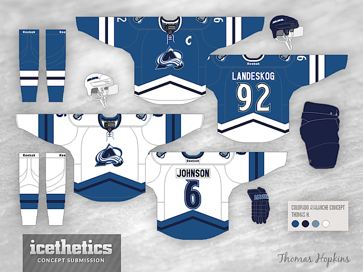
Thomas Hopkins gives us a very cold-looking Avalanche concept today. All those blues are making me very chilly. Brrrr.

Monday
Mar182013

0394: Green and Two Golds

i
626 VOTES

On the heels of St. Patrick's Day, I thought another green Dallas Stars concept was in order. Thomas Hopkins provides us with this look which, while more colorful, relies perhaps a bit too much on the wordmark style crest of the existing sweaters. It is the first I've seen to try a two-tone gold color scheme. Thoughts?

Thursday
Jan242013

0341: Swell Third for Big Apple

i
559 VOTES

I can't stop posting Lady Liberty concepts for the New York Rangers. Most of them are just superb. Especially this one from Thomas Hopkins. By the way, you may have heard the bad news. Until this season, the Rangers had been wearing the Lady Liberty logo on their practice jerseys. Not anymore. And that's depressing.

Thursday
Dec202012

0306: Black & White Isle

i
687 VOTES

I used to think there was no way to design a good hockey sweater using only black and white. I changed my mind today. This New York Islanders concept by Thomas Hopkins is inspired by the decision of the NBA's Brooklyn Nets to adopt this simple palette when they moved into the building they will soon share with the Isles. (End run-on.) Needless to say, I'm a fan.

Sunday
Apr152012

0057: Winter in Winnipeg

i
500 VOTES

Thomas Hopkins put together this Winter Classic concept for 2014. He envisions the game taking place in Winnipeg between the Jets and the New Jersey Devils. Odd partners sure, but as classic hockey jerseys go, you could do worse.

Errors occurred while processing template[pageRendered/journal.st]:
StringTemplate Error: Can't parse chunk: {settingHomePageKBArticle}" target="_blank">Learn how.</a></li>
<li>If you have already selected a front page, make sure it is enabled. Click on the Cubes icon (top right) and then click the "enable page" button.</li>
</ol>
</div>

: expecting '"', found '<EOF>'
StringTemplate Error: problem parsing template 'pageRendered/noDefaultModule': null