Thursday
Apr182013
0425: Get the Devils a Third Jersey
 Thursday · Apr 18 · 2013 | 9:00 AM PDT
  11 Comments

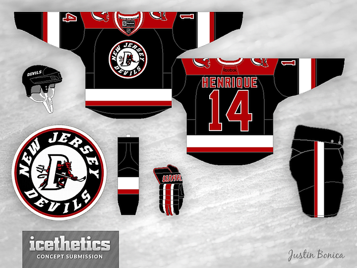
It's hard to come up with a good third jersey for the New Jersey Devils. That's probably why they've never had one. I'm not sure this one by Justin Bonica really hits the mark, but it's an interesting idea. The logo is borrowed from the old Lowell Devils of the AHL.
Designed by  Justin Bonica
 Justin Bonica


Reader Comments (11)
This might be the first time an NHL team got its logo from a minor league affiliate, instead of the other way around. That in itself deserves points for novelty.
I hate the Devils (Flyers fan); however, I think that their logo is one of a few that should never be touched or changed...much like the Flyers logo. You can design a new jersey, but keep the original logo and it would work for me.
Simple, creative, easily recognizable logos are hard to come by now, like the Devils, Flyers, Nordiques, Whalers, etc.
Not a terrible concept, however, that is a terrible logo. Jeez.
I think the best kind of third jersey for the Devils would just be a black version of their current one.
I think this lay out/template would work great with the Ottawa Senators
oh lordy. shoulda waited a day and posted this for FF. only thing the Devils should ever even consider is basically having a third that switches the black and red. logo and jerseys are already classics.
Used the current font for the numbers and make the names just white and they could be pretty good.
Have to agree about the logo. Sorry but this as mentioned before is a logo that would be very hard pressed to improved upon.
The jersey for me, the striping is too old school senators. I love it.. but it wouldn't work here i think.
For the Devils, i think you would have to think outside the box to come up with one that most people would like.
Arch or italics...not both. I have no idea where the "S" in "JERSEY" wants to go.
this circle with a wordmark and smaller logo inside is so played out. It looks great on Chicago's WC sweater, Columbus alt., and St. Louis. Other than that, teams need to let it go. Be more creative.
I dig the logo and the jersey! but if the logo didn't have the circular outline and just had the D and the devil it would be even better! other than that it is wicked.