Wednesday
May012013
0438: Eggplant and Orange
 Wednesday · May 1 · 2013 | 9:00 AM PDT
  7 Comments

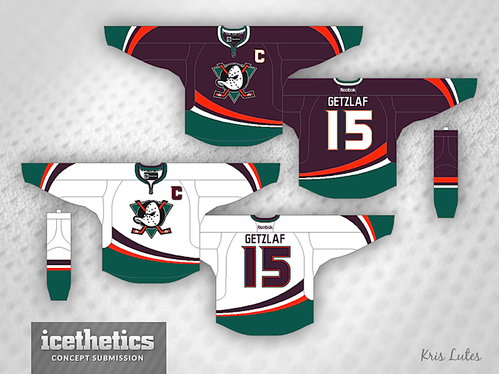
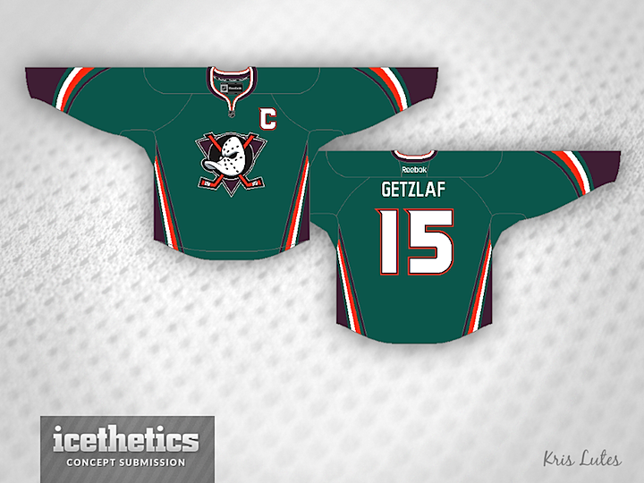
When the Anaheim Ducks rebranded back in 2006, they lost their unique color scheme in favor of black and orange — already owned by the Flyers. Sure, there's a bit of gold in there, but it's underused. Kris Lutes put together a concept that sort of merges the new and old looks of the team by adding orange their old eggplant and jade palette. I think it would look fantastic on the ice!

Also, as you may have noticed, I'm debuting a new concept template today. It features a jersey material background texture now, replacing the old ice. Think it fits better with what we do here on a daily basis.
Designed by  Kris Lutes
 Kris Lutes


Reader Comments (7)
Winner winner chicken I mean duck dinner on the first 2!
thought we'd seen the last of that damn disney duck logo......and those colors just dont go well together!!!
Lose the ridiculous striping. Go with your standard NHL stripes rather than the corny, Walt Disney, minor leagu version. I always hated the way the did that (same with Blues some years ago). I never was a fan of the name or logo since it was based off the movie, however, this color scheme, and reverting back to the original logo is 10-times better than the awful POS they have now. I actuially don't mind the 3rd .
I find the jersey background to be more distracting than the ice background.
Love at first sight.
You know, these really aren't bad. This color combo seems to work, although I'd prefer that they just return to being mighty in green and eggplant.
Yes, This needs to happen! At least the colour scheme. The lack of purple in the NHL now is a shame and the Ducks lost so much personality when they dropped the Mighty and went to a word mark.