Tuesday
May142013
0451: Toronto Throwback
 Tuesday · May 14 · 2013 | 9:00 AM PDT
  11 Comments

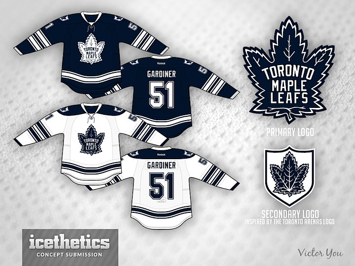
Here's a look I really love. Victor You has updated the Leafs' old logo and created a secondary mark inspired by the Toronto Arenas logo. Best of all he's gone with a very dark shade of blue that gives the whole kit a very classic feel.
Designed by  Victor You
 Victor You


Reader Comments (11)
The Leafs should really ditch their boring primary logo for this wonderful piece of art.
that would be a very cool alternate.
Change the bottom striping to horizontal and we are in business
So, so good. That's just fantastic. All the little details are great. From the shield patch to the double elbow striping to the numerals, to the slightly deeper blue. Can we see some breezers? When will this be on the ice?
Probably one of, if not the best concept I've ever seen here. Clean, classic, professional. Very well done!
4.5 stars for sure. the dark blue looks super sharp while the design is modern and retrospective at the same time.
I think these are great. 4.5 stars. The only thing that I don't care for is the number font. Change it to single block and I'd be a happy camper. Still a great concept that incorporates some different eras into the jerseys. Well done.
Gonna need more than new jerseys after last night
Excellent concept. Only real complaint with it is that the secondary logo is too similar to the primary.
My god, this is perfect
Great job! Love the blue jersey the best out of all of them. I agree that the number font should be a little different from the ordinary.
PS. Didn't the leafs wear the blue version during the Sundin (post Gilmour) years?