Wednesday
May152013
0452: Buffauxback
 Wednesday · May 15 · 2013 | 9:00 AM PDT
  14 Comments

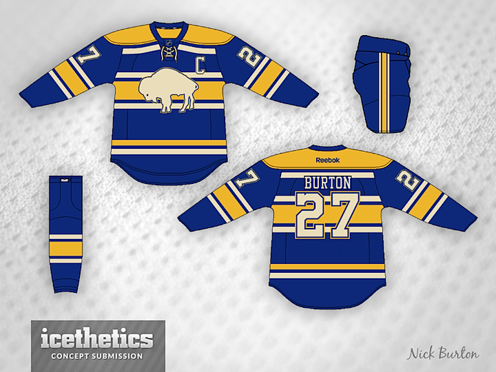
Ok, not sure if that title landed. I was doing a little word merging — Buffalo + fauxback (which is faux + throwback). It's all very confusing, I know. But Nick Burton has created a really sharp sweater the Buffalo Sabres might have worn had they existed in the 1920s.
Designed by  Nick Burton
 Nick Burton


Reader Comments (14)
I like it, besides the logo. It's not very fauxback if the logo is the Buffalo Bills primary used from 1970-73.
The thread title would have been smoother as "Buffalauxback," but the jersey is plenty smooth to make up for it. The only thing I don't like is that the white stripe under the shoulder yoke really needs to wrap around the entire jersey, even if that necessitates repositioning the sleeve numbers. Otherwise, excellent jersey!
Nice job. I can picture that in a winter classic. I move we call it the "Buffauxbackalo".
delete the one extra cream stripe at the top and you got a winner!
I thought this team was called the Sabres?? It's be nice to focus on that and put the current logo on the shoulder.
My one complaint is the logo - it's fine, but no where are actual Sabres seen.
Buffalo Buffaloes, though? Great jersey.
I don't know if it's just me, but for myself that jersey just screams St. Louis Blues. I can't put my tongue it but it has more of a Blues feel to it than to the Sabres. I could actually see them wear the design in a winter classic. Regardless, classy jersey!
I just had so many flashbacks of making fauxbacks for all 30 teams, haha. But all joking aside this is a beautiful jersey and I would beyond love seeing the Sabres use something like this in the near future. 5 stars for sure!
Only complaint: as was pointed out, it's the Bills logo from the 1970s. Put some swords on it and you got something cool here.
Still not a fan of "antique white". Outside of that it's a good design but not for Buffalo. Reading elements from other teams more than Buffalo's.
I like it but I'd like to see a bolder outline of the buffalo to make it look more distinct. Sort of the way Montreal's logo stands out overtop the stripes of their jersey.
I'm not artistically inclined on a computer or I'd love to make jersey concepts. That being said I'd love to see someone do a modernization of this 1930's Buffalo Bisons (IHL) http://en.wikipedia.org/wiki/Buffalo_Bisons_(IHL) jersey: http://3.bp.blogspot.com/-7r_vfn3398k/TV3vQbNFEHI/AAAAAAAABkk/c27jeLWJhWs/s1600/white_0016.2.jpg or this: http://2.bp.blogspot.com/-6Im4xNB0nIk/TV3vTmtJekI/AAAAAAAABko/kd-kFD4wUbw/s1600/BO_0019.2.jpg
brown pants and brown touch up on the piping, maybe an outline on the buffalo, and it'd make a great WC jersey
Would like to see with a sword of some sort. The team is called the Buffalo Sabres not The Buffalo Buffalos. However the jersey itself is excellent!