Friday
Jun212013
0489: Brooklyn BlackWhites
 Friday · Jun 21 · 2013 | 9:00 AM PDT
  9 Comments

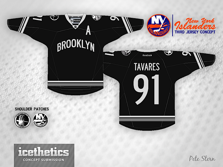
The New York Islanders have been back in the news recently with regard to a potential rebrand upon their relocation to Brooklyn in 2015. Will they align with the NBA's Nets and go black-and-white? I don't know, but I don't think Pete Stern has the best solution. Maybe if the front had a logo? But then this is a Freak Out Friday.
Designed by  Pete Stern
 Pete Stern


Reader Comments (9)
Horrid, but somehow still better than their current black jersey...
I think an "Islanders" wordmark would work better here and the actual template doesn't seem right but otherwise it's not terrible (then again, I like the Nets' current jerseys and this derivation).
Haha, a 1,5 Star average. That must be the lowest any concept ever got!
No........just.......no. this would be without any doubt, the worse jersey to appear in the nhl, ever!! i truly hope the move to brooklyn doesn't mean the isles will lose the white / blue / orange colors that they've always had.
It's not that bad, I actually like it as a 3rd jersey, especially the stitching of the jersey (I assume that's custom made). I usually don't mind wordmarks when it fits, but in this case, since the jersey's so minimalistic, it would look much better with a logo.
yes, logo is needed. not sure how i feel about the striping.
Honestly, I think there's something here. I agree with Jack V. that this would make a nice 3rd jersey. It'd be a heck of a lot better than their current 3rd that's for sure! To me though, the primary jersey has to have the team's logo on the front. If it's not present, the team misses out on a great branding opportunity. I like the bridge shoulder patch and the secondary colors to this black concept.
The BlackWhites? Haha, didn't think that I would see a CFL reference on here.
The Stripes on the sleeves and the bottom should be the same widths as the current jersey and to teally make it work all of the lettering and logos should be trimmed in blue and orange ...