Wednesday
Jun262013
0494: Return of the Barons
 Wednesday · Jun 26 · 2013 | 9:00 AM PDT
  7 Comments

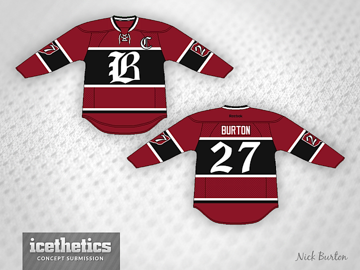
As long as we're looking back at defunct NHL franchises, how about Nick Burton's take on the Cleveland Barons? I could see something like this in today's NHL.
Designed by  Nick Burton
 Nick Burton


Reader Comments (7)
Very good work and a nice looking jersey, the only thing is the Captains "C". Should use the same font as the nob. The numbers are great overall good job. Keep it up.
i do like the sleeve numbers inside the state of ohio. not quite sold on the number font.
While this is an okay jersey, I feel as though something is missing from it. Maybe a logo instead of the Olde English "B" would work better.
Not bad at all. I only rated it a 4 because I've always just loved everything about the old Cleveland Barons unis and I don't know if the y could be improved upon.
Clearly a Montreal Canadiens jersey.
The Montreal Barons ?!?
Get rid of the gap in the upper left of the B - the way it looks now - its LR on the jersey.
Otherwise I like it - its similar to the B I use as my logo on my jerseys of my fantasy hockey teams - Buffalo Freeze.