Friday
Jun282013
0496: Return of the Freak Out
 Friday · Jun 28 · 2013 | 9:00 AM PDT
  9 Comments

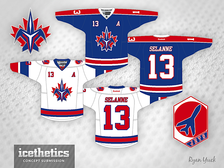
We're wrapping up this week of concepts for past NHL clubs with this trippy idea. It's sort of a mix of the Thrashers and the team they became, the Jets — with the old Jets' colors. It's all very complicated and exactly what I look for in a Freak Out Friday post. Kudos to Ryan Yuck on that.
Designed by  Ryan Yuck
 Ryan Yuck


Reader Comments (9)
I actually really like it. I think the colours are good and the logo isn't bad. Some type of futuristic Jet. Not sure if I want to see this on the ice, but I think its a rad concept. Nice work fellow Ryan
Gotta say, this actually isn't all that bad. I was never able to figure out exactly what that Thrashers' "T" logo was supposed to be (except a really funky-looking "T"), so this is kinda nice.
Nice! Very Toronto Blue Jays!
same as what ryan m said, but i will say i do like the shoulder patch.
The current uniforms are not this good and the current logo is only marginally better. This is not a Freak Out at all.
That logo is freakin' SWEET! Very creative!
I actually tried to think of a way to combine both franchises' identities, but I came up short. You nailed it! How about one in the Thrashers' color scheme?
That logo and those uniforms actually work....... really, really well. Wow, very good job, especially for a Friday Freakout.
Actually, with a small tweak to the bottom wings of the jet, it'd be an interesting crest for a Quebec team because of the Fleur-de-lis look to it. Would make for an interesting follow up
they wish selanne was on their team