


Saturday
Jul062013
0504: Battle of Los Angeles
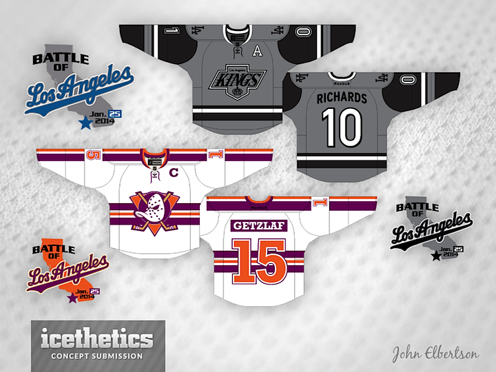
We've got another Stadium Series concept for this Winter Classic Weekend. John Elbertson plots out a couple of completely new Kings and Ducks uniforms for the game at Dodger Stadium. What do you think? Curious to hear what everyone says about this one.
Designed by  John Elbertson
John Elbertson 
Reader Comments (18)
love the kings jersey! not so much on the coloring of the ducks jersey- I hope they go full mighty ducks for this game
love both. that is all.
as a longtime ducks fan I really think that ducks sweater is a really cool combination of old and new colors. always glad to see the original logo on the chest. I would say get rid of the colored nameplate because im pretty tired of those
Wow I really like the idea for the Ducks. Its different and it works really well. The only thing that bugs me about the Ducks jersey is the orange in the logo, make the logo look kind of, amateur, and minor league. Pehaps swapping out the orange for grey like the Mighty Ducks of Anahiem used to would be a better idea. The kings concept on the other hand is bland, too dark, and kind of boring. They should use that logo though. Black and grey doesnt seem winter classic to me. Purple and Yellow is what LA should revert to.
Lose the LA Dodgers logo.
Like the kings jersey a lot, though a shade lighter grey might be better.
I refuse to comment on whatever is in the lower left.
I really like the Kings, especially with the Dodgers LA logo on it. That should be something the teams do in the "Stadium Series" Rangers get Yanks though, not the Home Islanders and Devils (they gotta be kidding with that)... not crazy about the Ducks. I hope they dont revert to Mighty Ducks because that was an embarrassment
Love the Ducks jersey, it is so hyper-outrageous that it works as a one-time-only jersey.
The Kings jersey on the other hand is too dark. It'll turn into a bland, charcoal mess on TV. Flip the gray and the black so it has grey sleeves with a black body and then change the grey to more of a lighter silver and it'll look good too. Or they could just bring back the Lakers-like Forum Blue and Gold.
The Ducks' design is...different. I can see the Kings in their uniform set, as the use of gray works well with the black, other than the numbering.
Im really intrigued by the Ducks concept. It's kinda like their late 90s alt, but replaces jade with orange, which Im not a fan off. I think you should have used a lighter gray for the kings concept, and no Dodgers logos on the shoulders. Good idea, but it doesnt really work well with the kings' logo set.
I really love the Kings' jersey here. Anaheim...eh...
These are awesome... especially the Kings one.
I really like both. LA in grey steps into territory that seems to be a no-go zone in the NHL, and the Anaheim concept is a bold step away from the cookie-cutter designs we see on the ice currently.
Wow, I don't know why but I really love the ducks jersey.
I like the style of both jerseys, but the colours are just off. I like the idea of a grey Kings jersey, but the grey logo on grey background doesn't work. Maybe if the colours in the logo were reversed, it would be better (what is grey becomes black, what is black becomes grey/white). I also don't like the Dodgers' LA logo on the shoulders.
As for the Ducks, I really like it, but orange and purple doesn't work. How about using the current Ducks colours of Orange, Black and Beige instead. I think that would be much better.
What I give him major props here for is using tons of creativity, especially for the Mighty Ducks concept. Only thing I'd do is lose the orange and add the jade(especially behind the duck mask). Other than that I love the different stripe pattern uded here.
As for the Kings, as others mentioned just drop the Dodgers logo it's out of place and a weird way to mix brand, also not sure how the grey would look on TV but it works well here.
they both look good but drop the battle for losangeles ducks are from Anaheim OC . i dont want to see losangeles on a ducks uni . its direspectful who ever thought of that.is an idiot
I Don't like the font on the LA jersey. Also the la logo gets lost in the jersey. Perhaps make it white with grey font?