Monday
Jul082013
0506: The State of Hockey
 Monday · Jul 8 · 2013 | 10:00 AM PDT
  18 Comments

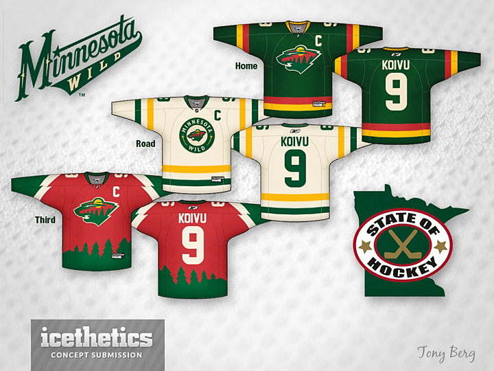
Those who don't like non-matching jersey sets probably won't care much for Tony Berg's Minnesota Wild concept. But I think it's really sharp. I don't love the sublimated third jersey, but then third jerseys should be for experimenting. Where do you stand?
Designed by  Tony Berg
 Tony Berg


Reader Comments (18)
Awesome home and away designs. Great use of broad strokes and bright colors. Would be better without the '90s alternate.
Looks like the 90's Canucks, just green.
Sorry, not too much of a fan of any of them, but I like the concept of the 3rd. The ideas behind it. Not crazy about the actual jersey itself.
How can anyone not give this 5 stars? All three jerseys are SHARP. Very well done! I really enjoy the trees lining the bottom of the third jersey, it balances the red and blends the colors marvelously.
Wow, these are beautiful. I especially love the white away jersey. I like the red third as well, but I think I'd look better if the trees at the bottom of the jersey weren't so big and invasive. I also like the green jersey, but I just feel like the yellow isn't working as well on that one as it is on the white one.
As was stated previously, the green one looks like the Canucks from the early 90s. I REALLY like the white one though. And I agree with Chris about the third jersey being for experimentation. Do something crazy - why not? Just as long as it doesn't get promoted as has happened with a number of thirds over the years.... unless the third is better - which this one isn't. That is all.
Loving the third jersey. Would be so unique in todays NHL.
Like the home & away sweaters. I don't like the 3rd jersey for reasons others have already stated - looks too 90's, looks like the old Canucks' 3rd jerseys.
I LOVE the away and third jerseys, but I think the colors on the home are a little too contrasting. The red AND yellow stripes on the dark green jersey just don't mesh well IMO. 4 stars from me, nice work.
love the colors for the home and road. almost retro. very cool. would stand out in the land of reds, blues, and blacks.
chris is right. third is kind of meh. the third is like "if you had to make an obvious 3rd jersey for the wild, what would you come up with?"
L cool
The third jersey is too much like a minor league jersey. But I like the home and away jerseys, maybe the home should lose the yellow and just do red and green, though, it might make it too christmas-y. But simple and different home and away jerseys are unique and appealing and is much needed for the NHL.
Drop the Red from all of it, and Bring back the Kelly Green and Gold... the old Northstars would play great in Minnesota
Before Minnesota can have a fresh and clean look, the Wild name has to go. It simply does not belong in big league hockey and doesn't have the same appeal as the North Stars brand.
One name I think would go very well with in the State of Hockey is Moose, which was the name of Minnesota's IHL team before moving to Manitoba. Moose is also plural of the same word. The similar named Halifax Mooseheads have been a strong brand in Eastern Canada, even before winning the Memorial Cup. The colours and uniforms are also identical to the Wild. If there was a way to design a concept that consists of the Manitoba Moose's last logo and the Wild's logo, I would love to see it.
I'm an ENORMOUS fan of the white road jersey, but the home just doesn't look right to me. I think it's the red, maybe if it was white. The 3rd just smacks of a 1-time Christmas jersey...
I would buy any of the three jerseys if they hit the market today.
All three jerseys are amazing. Very sharp. Great look for Minnesota.
Overall I'd be upset seeing these in Minnesota... The third looks like a AAA summer league jersey and the home just shouldn't mix those colors. I do like the away one and would really be interested to see what the home would look like with that color scheme. I think the Wild need to ditch the red/burgundy/whatever it is and have green be the obvious primary color. Before Dallas changed jerseys the Wild were basically the only team with a dominant green. I could definitely see a change in color scheme to a more North Stars esque style, but we'll have to see if management doesn't get all caught up in the "we want to be our own franchise" stuff.
The white one is sexy