


Thursday
Aug152013
0544: More in Montreal
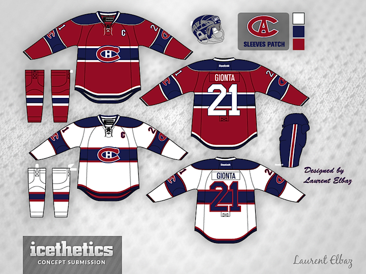
Yesterday we got a look at a female version of a Montreal hockey team. Today, we stick to the same city but switch back to the NHL. Laurent Elbaz tweaks the typically untouchable Habs sweaters. I'm intrigued, but before I'm sold, something will need to be done to make the number legible on the back of the white sweater — that's why they dumped the blue stripes ages ago.
Designed by  Laurent Elbaz
Laurent Elbaz 
Reader Comments (9)
I'm not sure why the Habs never thought to use red letters on the blue-stripped white sweater? It the most logical solution. With the right trim it could stand out quite well. Maybe solid white trim?
I like them, but a couple tweaks would help. Dump the shoulder yoke on both, get rid of the sleeve numbers and keep the logo on the arm band. Finally, the numbers on the white one... damn, I wish there was a way to make them legible, because that blue stripe on the white jersey is gorgeous!
I stand corrected. The Habs DID use red numerals in 2009 for their white throwbacks.
http://img0024.popscreencdn.com/151993174_amazoncom-saku-koivu-montreal-canadiens-1946-ccm-vintage.jpg
And also for the legends game at the Heritage Classic.
http://i19.photobucket.com/albums/b154/spyboy1/TSG%20Blog/Gretzy_Gingras_Heritage_classic_200.jpg
There is a way: Have the blue stripe stop just on either side of the number area, leaving a blank white square where the number are place. This way, you could keep the blue numbering.
On the white jersey, just switch up the colors on the numbers. Red with blue outline. And you'll have a winner!
Red numerals on the blue background do no stand out either. There are 2 possible solutions that could work nicely. One would be to put a square blue patch (rugby jersey style) and then put the number within the patch in white. THe other solution would be to not have the strip go all the way around the back. Simply have a break in the middle of the back stripe wide enough for a 2 digit numeral.
Not loving the blue number on the blue stripe but very good overall.
Chris, it was hilarious to watch yesterday's female version on Montreal hockey team with a huge " M " on the crest. Today's version is more suitable for being a female jersey with a couple of tweaks here and there... Okay, on a concept itself : 1. sleeve patch needs to be move on top of the yoke ( having identical shape as a crest - sleeve patch doesn't look right on a sleeve ), 2. sleeve stripes must be straight like on a chest stripes to look uniform, 3. tv numbers can be placed inside sleeve's stripes, 4. chest band on a white jersey must have a white stripe on either side between a blue and a red to look similar like on a crest ( same goes for sleeve stripes ), 5. to make numbers more legible on a back of the white jersey - simply change their colors to a red with a blue and white outlines respectively, 6. top line of a collar of the white jersey needs to be in red with red laces, 7. it is kind of strange that " Habs " dumped blue stripes ???
The numbers were red outlined with red originally so idont see how they couldnt see the numbers lol you saying they dumped it for that reason is wrong cause they didnt have blue numbers like this one and NHL 13 used the 1940s white that had that problem but in 06 they had red numbers with red out like and you could see them fine