Wednesday
Aug282013
0557: The WNHL Series, Part 3
 Wednesday · Aug 28 · 2013 | 10:49 AM PDT
  10 Comments

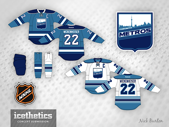
Nick Burton's six-part series on a fictional women's hockey league picks up today with the Toronto Metros. How do you think the league is shaping up so far?
Designed by  Nick Burton
 Nick Burton


Reader Comments (10)
I could actually see the blue jersey being worn with the white socks. I think that would look cool.
Beautiful! Really great job on each one so far. 5 out of 5 from me.
This is a nice idea. But all that white space at the top of the shield looks a bit awkward. I dunno, maybe a white city on a blue background would work better?
Hate to say it but the WNHL shows promise of looking better "icethetically" than the IceHL. Well done so far Mr. Burton.
Nice jerseys and all, but I've been wondering: what exactly is the point of it being a fictional WOMEN'S league? It's not like the jerseys are all pink with flowers or anything(not that they should be). These all could just as easily be men and could be just a normal fictional league. It's not that I'm opposed to women's concepts or anything, but I figured I you're gonna make a distinction that its a women's league it's for a reason.
I minor inconsistency. The waist stripes don't match the stripes on the crest. I think the crest stripes look better personally. Would like to see the blue area below the stripes on the jerseys be carried over onto the sleeves as well. Overall a really good design though.
I would prefer the Metros being the official name of MLS's Toronto FC. And speaking of soccer, the shield logo is actually identical to the NASL's Toronto Blizzard. Sorry to get off the topic of hockey but the logo and name had "soccer" written all over it.
It might be better to simplify the striping. For instance on the dark jersey, one dark blue stripe on each side of the white rather than two. But the colours are nice.
I love double blue. 5 stars from me.
LMNOP, when you make your own league, you get to make those decisions. I enjoyed watching our women's team while in college, and I'm happy that somebody is trying to raise awareness of the women's side of the game.
amazing color scheme, crest is pretty good, but the only thing that bothers me on this sweater is the piping on the yoke. too much, but that's coming from a traditionalist. four out of five.