Entries in columbus blue jackets (17)

Tuesday
Jan282014

0711: Blue Jackets a Century Back

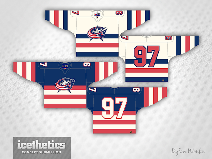
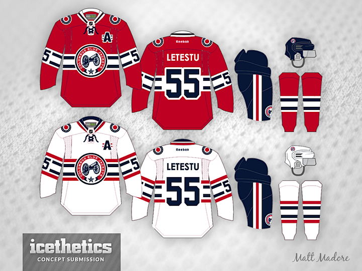
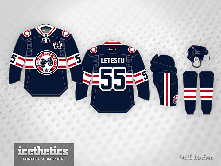
Dylan Wonka is working on a new series that imagines what certain NHL might have looked like if they'd existed back in the 1920s. We'll kick things off with his take on the Blue Jackets — of course I doubt anyone in the early 20th century was designing logos quite like that one.

Tuesday
Dec102013

0662: Ohio Pride

Today we get a neat alternate jersey design for the Blue Jackets from Avi Stein. He writes:

I think that the Jackets should try to market themselves better to the entire state of Ohio, as a lot of people from the Cleveland area follow Buffalo, Detroit, Chicago, Pittsburgh, etc. So, this uniform speaks to the fan-base, and solidifies the notion that the Columbus Blue Jackets are indeed Ohio's team.

Tuesday
Nov262013

0648: The Red Blue Jackets

Given the team's name, it may seem like a non-starter, but imagine the Columbus Blue Jackets with red as their primary color. That's what Matt Madore presents today. It's a great looking set of jerseys even if it doesn't belong in Ohio's capital.

Tuesday
Nov052013

0627: Fixing the Jackets' Third

Not everyone is a fan of the vintage white-infused Columbus Blue Jackets' third jersey. So Kris Lutes created a different option with more red. How do you like the use of the Ohio state flag striping?

Wednesday
Aug072013

0536: Soldier On

The Columbus Blue Jackets are named for the soldiers who fought for the North in the American Civil War. Maybe they should start looking like it. Brandon Manzione designed this brilliant logo along with a part of sharp sweaters. What do you think? Time to ditch the flag-wrapped star?

Friday
Aug022013

0531: Blue Jackets Freak Out

For this Freak Out Friday, Ryan Yuck mixes eras in Columbus. Check out that crazy crest.

Monday
Apr012013

0408: Columbus Blue

Um, it was either post this on Freak Out Friday or April Fool's Day. I usually love Justin Cox's work, and while I like this unique take here, I hope it never sees NHL ice.