Entries in san francisco bulls (6)

Friday
Dec202013

0672: Minors Week Freak Out

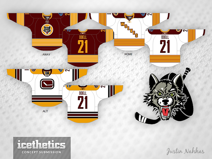
Minor League Week wraps up up with a super-sized Freak Out Friday. First, Justin Nahhas offers his redesigned Chicago Wolves jerseys. The home and road options aren't too crazy — though they do follow the template used by the Penguins in their last Winter Classic appearance.

The alternate jersey is what should freak us out. To be fair, Justin submitted this concept almost two years ago when the Wolves were still affiliate with Vancouver, but could you imagine a Canucks logo on the jersey of a Chicago-area team? Of course, the subtle "C" in that stick-in-the-rink logo could stand for Chicago, right?

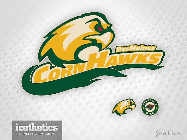
Another oldie I'm just getting around to posting is this one from Josh Olson. Last spring, in between learning the Houston Aeros were moving to Iowa and what the team's new name would be, Josh sent in this idea for a rebranding. He admits making up "CornHawks," but there's no reason it couldn't work as a team name. Do you prefer Des Moines CornHawks or Iowa Wild? (Both are a bit of a mouthful.)

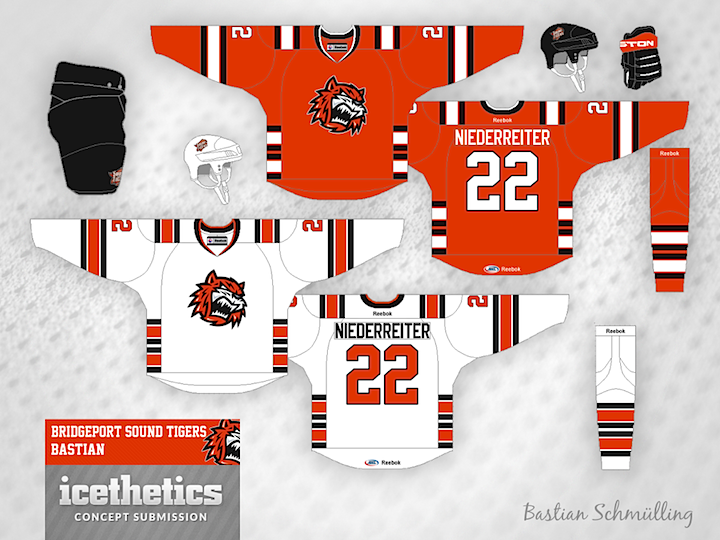
The ever-creative Bastian Schmülling completes a run of being featured on this page for three straight days. Here, he's redesigned the look of the Bridgeport Sound Tigers — swapping Islanders blue for nice shade of black. What do you think of the striping style? I think it's a little out there.

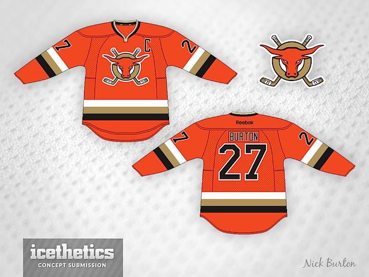
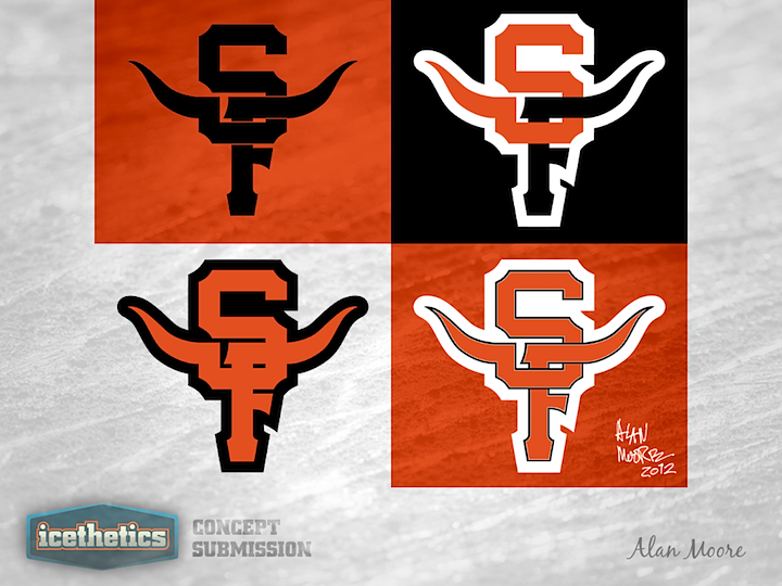
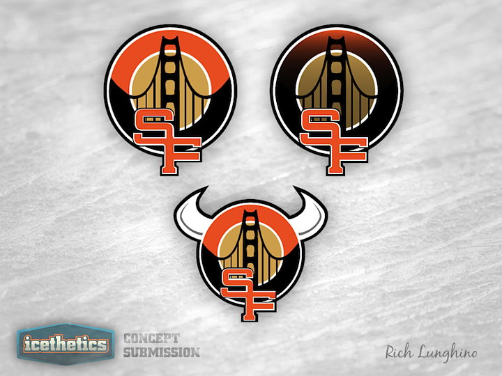
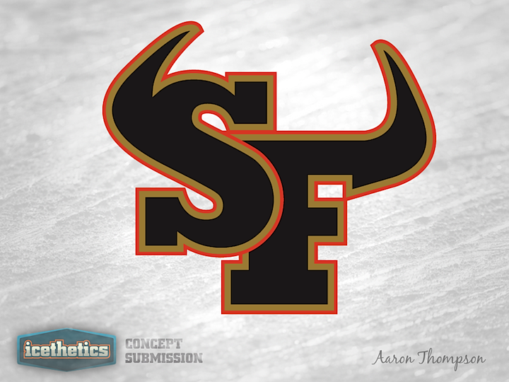
And finally, Nick Burton brings a redesigned orange jersey for the ECHL's San Francisco Bulls. What freaks me out is the sunburned bull on the crest. Yikes! Nice jersey, otherwise.

Check back here tomorrow for a concept that previews Chicago's Stadium Series sweater!

Sunday
Sep022012

0197: San Francisco Sunday, The Finale

Today brings the last of five San Francisco Sundays in which we get a look at logos that were submitted to the ECHL's new Bay Area expansion team, the Bulls, for use as a secondary mark. Though technically that doesn't apply to today's set. Benoit Lacaille just sent me these in the last few weeks so they weren't proposed to the team.

Hey, that hexagon looks familiar!

It was a neat series but I think we're done with San Francisco Bulls logos for a while.

Sunday
Aug262012

0190: San Francisco Sunday, Part 4

We're continuing the San Francisco Sundays series of potential secondary logos for the ECHL's new franchise, the Bulls. We start with Antonio Calisto's attempt. It's pretty sharp but it does lack any representation of the Golden Gate Bridge.

Alan Moore produced a series of Giants-style logos with horns protruding out of them.

And Ryan Muraro didn't just intertwine the S and F together but also with the Golden Gate Bridge. Not a bad look, but maybe a little less with the gradients. But it does go well with the team's existing primary logo.

Sunday
Aug192012

0183: San Francisco Sunday, Part 3

Mark Morgan was the most prolific designer to take a swing at designing a secondary logo for the ECHL's new San Francisco Bulls. So I'm giving him this San Francisco Sunday all to himself. The first design features a pretty straightforward look. It incorporates the primary logo, the intertwined SF and the Golden Gate Bridge.

This next one is my personal favorite. At first glance, it looks like a weirdly-shaped SF. But look again. It's the head of a bull in profile! I didn't even know that was possible!

The last one doesn't quite use the right colors but it's still a solid and simple patch design. So which of Mark's three is your favorite?

Sunday
Aug122012

0176: San Francisco Sunday, Part 2

Tyler Rodgers has created a beautiful mark, which is exactly why it doesn't belong in the San Francisco Bulls' existing branding. Wouldn't fit in with that primary mark at all. But this is really a great design and I hope someone buys it from him one day.

This is a pretty solid design as well, but it fits better within the Bulls' existing look, especially with the gold gradients. I'm not saying that's a bad thing, though. He's certainly improved upon their look.

And finally, David Streeter shares a few horned intertwined SFs. He hasn't incorporated the Golden Gate Bridge, but they're still decent designs. So what do you guys think of today's set?

Sunday
Aug052012

0169: San Francisco Sunday, Part 1

Back in February, the ECHL expansion franchise San Francisco Bulls, told Icethetics they'd consider some user contributions for their secondary logo. Five months later, they've seen the submissions but have yet to make a final decision. So starting today, those logos will be posted here in a series called San Francisco Sundays.

First up is Rich Lunghino's excellent effort. In their guidelines, the Bulls asked for a secondary mark that included a unique intertwined "SF" and a POV perspective of the Golden Gate Bridge. Rich hits all the marks here and even offers a couple extra versions.

Pat Waller's design is such a simple idea that it's almost perfect. It doesn't reference the team's name, but as a secondary logo, it doesn't really have to. However, any structural engineer (or not) will tell you this is a bridge built to crumble. Perhaps not the greatest symbolism for a start-up hockey team.

No bridge here on Aaron Thompson's attempt but worthy nonetheless. I'm liking the horns. What do you think of these three? Do you have a favorite yet? Looking forward to next Sunday's group?