


Tuesday
Aug092011
Collection 46: Sunny South Florida
 17 Comments
A few weeks ago I promised a concept post dedicated to the Florida Panthers. That was before the Winnipeg Jets logos happened. Now it's been way too long since the last update, so it's time to deliver.

Still working on theme ideas for the next post. If you have a suggestion, let me know.

Reader Comments (17)
I like louie's jersey, but i think i would opt for navy pants and jersey-matching red socks
Toronto
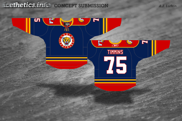
A.J Lufkin's concept looks great!! Great way to blend the different eras of the Panthers jersey history into one jersey.
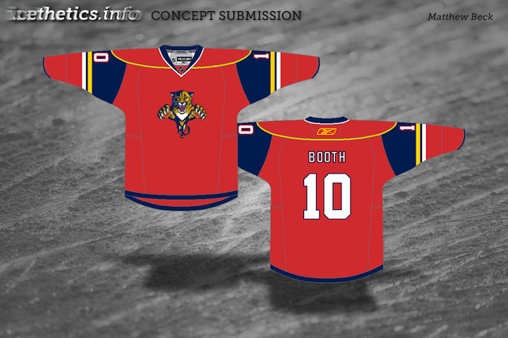
Absolutely love Mike's concept. Its a great mix of the old/new and his own twist on it. I would be so happy to see the Panther's wearing that! Great work Mike.
Red Wings alternate concepts next.
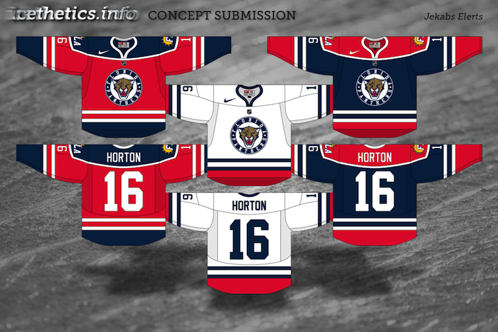
Everyone has their own favourites. Mines Jekab Elerts' home jersey. Love the use of those white stripes in the waist and arms. The away jersey ain't that nice imo. The alternate jersey would look good on my favourite SM-liiga team Jokerit (from Helsinki). Just make the red less pink and change white to yellow. They've been using the blue Panthers jerseys anyway.
Ever consider archiving the concepts by team?? Have a fixed gallery of concepts for each team. You don't usually get to compare concepts per team over time.
I also thought it'd be cool to have a concept tournament.
Mikes concepts are far and away the best. The only thing I'd do different is instead of the panther head, have an updated full body panther. Oly change I'd make
I like Mike's, except for the logo. I know simplicity is in right now (Tampa, Nashville, Los Angeles, etc), but the Panthers' logo needs to remain the exception. That's the only reason it's not a 5-star jersey set IMHO. Jekabs' concepts are interesting, but, again, the logo takes away 1 star, and a complete lack of yellow AND the use of that hideous shoulder patch instead of the palm tree/hockey stick one drops another star (or 1.5, but I can't do that) for me.
I think that your should try a minor league concept theme, or a northern midwest theme. I haven't seen any concepts for Detroit, Chicago or Minnesota in a long time.
california theme
I can't get over how good the 1st concept looks...
A Wild theme would be most excellent.
am i the only one who is getting a bit tired of the circle logo's for third jerseys/
Drew, the panthers logo sucks. Simplicity is important, florida's has always been too detailed and unbalanced. Simplifying it and fixing the visual balance (by removing the body) makes a giant difference.
Also, the panther head looks much better without the circle.
But Mike's concept really shows what a panthers jersey could be if they just dropped the crappy logo. Perhaps the logo looks okay on its own to many posters, but it's never looked good on a jersey.
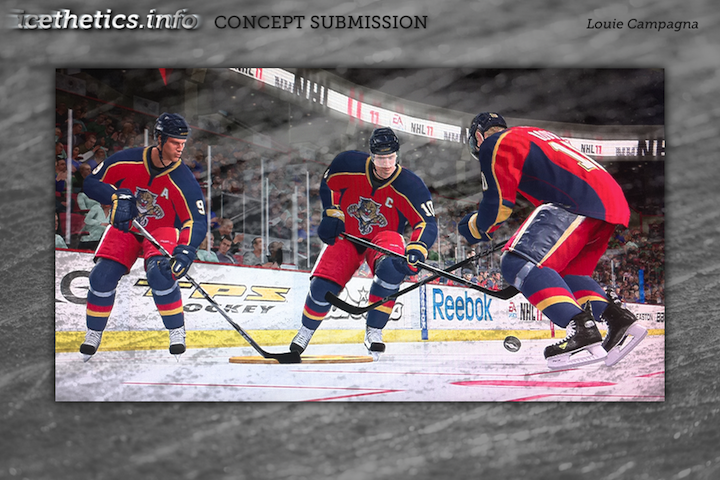
Wow! Louie Campagna's design for the Panthers with the red sweaters, red striped pants, and blue socks look great!
@Jeff The Panthers' logo is actually one of the best in the NHL, IMHO, and I know that the fanbase (as small as it is) greatly prefers the full-body Panther logo to any other version the Cats have used.
I will say that the Panthers did used to use just the head of the current logo as the center ice logo for years and it looked good there, but it wouldn't on a jersey.
I agree, simplicity is important. But it's not about the logo being simple, it's about the CONCEPT being simple. Some of the best logos (Sabres, Bruins, Flames, Blackhawks, Avalanche, Red Wings, Wild, Penguins) are simple in concept and intricate in design (same order as before: Buffalo charing with crossed swords, B in a spoked wheel, flaming C, profile of an Indian head, A with a snow accent, winged wheel, bear's head with a forest inside, skating penguin). You can't tell me that those logos all suck because they aren't just a few basic shapes. Yes, some of the more-intricate logos are pretty bad (Senators, Canucks, etc), but they certainly are not ALL bad.
Simple design logos can be great (Oilers, Canadiens, Devils, Rangers, Flyers, Blues, Leafs, maybe the Lightning), but they are certainly not the ONLY great logos. Simplicity is crucial in CONCEPT, but not a necessity in DESIGN. And the Panthers' logo is perfectly simple in concept (a leaping Panther) and perfectly intricate in design.