


Friday
Jul292011
Collection 45: No Shortage of Suggestions
 20 Comments
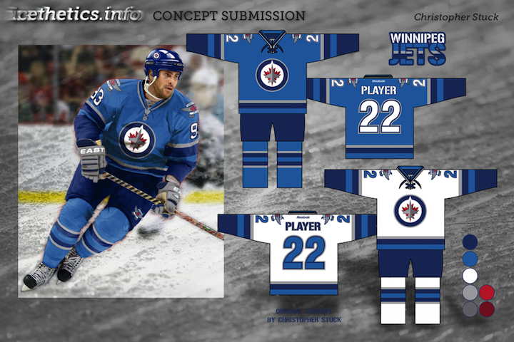
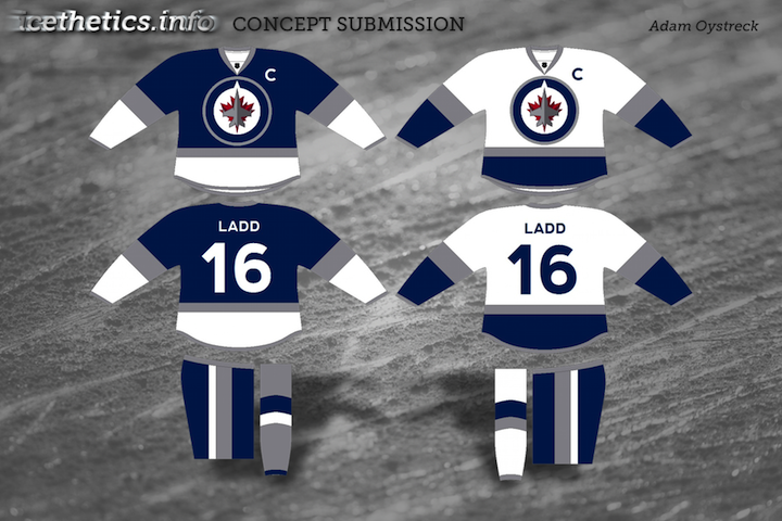
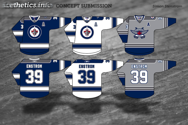
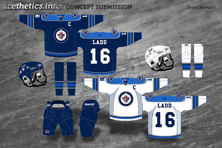
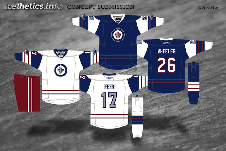
The Winnipeg Jets have not yet announced a release date for their new uniform design, but there are certainly no shortage of suggestions from Icethetics concept artists. In this set, we see the red start to disappear from most of the jerseys.
I'm sure there's still more to come. And at some point soon I'll try to work in that Florida Panthers post I promised a while back. Obviously the Jets are the hot topic of the moment.

Reader Comments (20)
I really like Simon's.
Simon's submission is TOP NOTCH. very nice work.
I dont know how I feel about the Jets using the same color as the thrashers. It feels like it's too soon. Christopher's jerseys look really nice
yeah, simon's is great. I don't think a light blue works and its gotta have grey.
I think Christopher Stuck's is a great example of how what may not look good on a template can look fantastic on a player. When you see the logos on a jersey, they look tons better than they do on their own, or on a template. I love the idea of using that lighter blue as a primary color, though. Also, with Simon's, I prefer the striping of the third jersey, and wish it was on all of them.
Trent's concept looks a lot like Panthers' blue alternative jerseys
Struck's design is by far the best, hands down!
Love the addition of putting it on Buff, too.
Simon's is the best.
And not only am I saying this because it looks great, but becasue I really hate it that the Jets might use a color on their jersey that ISN'T EVEN ON THE LOGO.
After seeing Christopher Stuck's concept I know I'm gonna be disappointed with whatever the Jets unveil
I had zero hope for these jerseys until I saw Christopher Stucks concepts. Those are awesome, and I doubt the real sweaters will even be half as sweet!
I really like christopher stuck's concept, but it's hard for me to imagine reebok coming out with a jersey so simplistic. They would probably tell TrueNorth it needs more piping. ;)
You know, I was freaking at the idea of using the powder blue over red... But after seeing how Christopher made it look SO FLIPPING GOOD, I just KNOW Im not going to like the actual reebok product nearly as much as his design! The grey gloves are a REALLY NICE touch as well... Well done sir, well done!
agree with B.A. whatever the jets unveil wont come close to christopher stuck's concept. it looks so awesome on the player, pays homage to atl w/ use of light blue, makes boring logos look cool. filthy concept, u should sell it to the jets force em to use it
I LLLLLLLLLLOOOOOOOOOOOOOOOOOOVVVVVVVVVVVVVVVEEEEEEEEEEEEEEEEE Christopher Stuck's Concept!!!!!!!!!!!!!!!!!
Thank you so much for the kind words, everyone! I'd just like to point out that the stripes I used are exactly the same as the ones featured on the Jets website, with a silver / navy / blue / navy pattern, with the silver stripe being roughly 50% as wide as the others. That's how I got there.
Simon's looks an awful lot like the Sudbury Wolves of the OHL
This is purely my own preference, but I really hope baby blue is left out of the jersey design. Two-tone blue has been done to death lately (Penguins, Panthers, Thrashers, Blue Jackets, Blues), and IMHO the best designs in the league use a limited colour palette, typically limited to a maxmium of two colours other than white.
When you think of teams with sprawling colour schemes, you think of garbled messes like the Thrashers, Ducks alternate, previous Preds, and the uglier designs in the Penguins', Blues', Canucks', Coyotes', Stars', Senators' and Islanders' history.
The Jets should be trying to forge a clear identity, in much the same way the Lightning, Predators and Panthers have done recently (and which the Red Wings, Devils and Canadiens have done in historically opting against third jerseys). They chose a simple logo, I can't imagine they'll do anything flashy with the jerseys. Probably navy blue, with simple grey and white striping. While almost certainly fake, some "leaked" designs showed up online recently that are probably closer to reality than any of the concepts I've seen here (mine included)
I'd just like to take a minute to again point out that the RCAF's flag is pale blue.
Hmm, haven't seen the Wolves jerseys before, so had to check it up. I'll admit the blue one have a similar appearance their old jersey (the white and grey one have really no resemblance except the colours), though the striping is different on both arms and waist (lesser striping on mine). Still, my main inspiration was the last Jets jersey, but with a different colour scheme, to have a nod to the past on the new jerseys.
Anyway, thanks for the kind words, I really don't like baby blue, feels like the dark bue works better with grey and white which is why I left the baby blue out. And I'm also not a fan of using colours not in the logo for a hockey jersey.
Taoiseach is right - the RCAF use a pale blue, so I would expect the Jets to do so as well. I agree that Christopher's design does the best for that crappy logo. Unfortunately the real uniforms will likely have the logo about twice as huge as Christopher's and they won't be nearly as nice.